At Great Northeastern War XXXIII this year, I took on my first apprentice in the SCA, Caitrìona O’Siodhachain. As part of the ceremony, I wanted to give her a gift that related to her areas of interest, which include nature, illumination and embroidery. After thinking for a while, I came up with the idea of giving her a box to keep her embroidery materials in, and decorating it with an illuminated image.
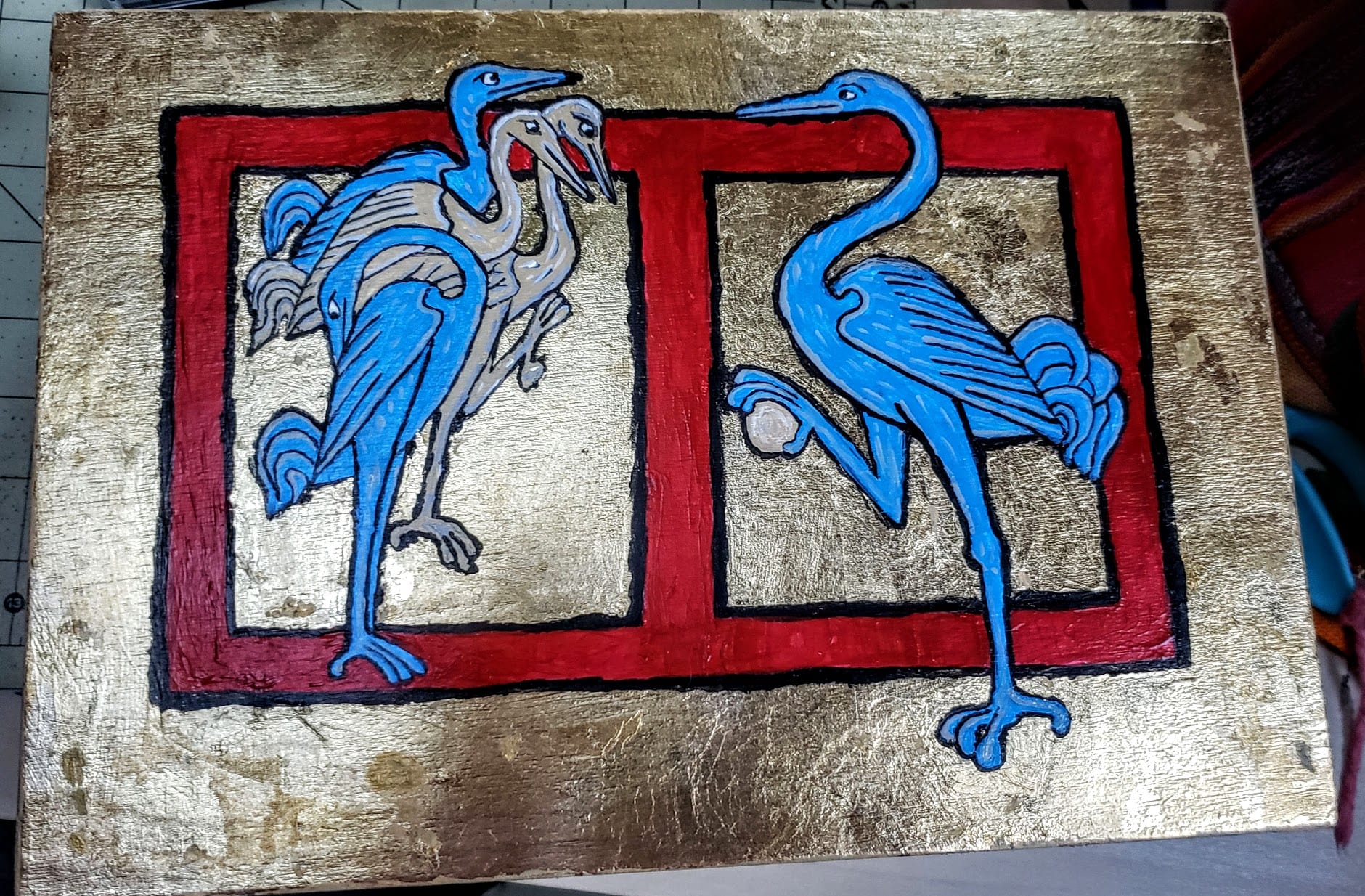
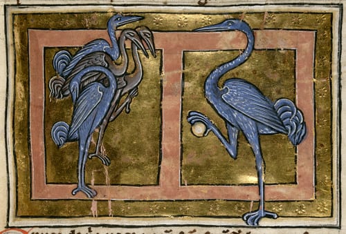
The design I selected to use is an image of cranes from a 13th century northern/central British bestiary manuscript, currently housed in the British Library. Personally, I love cranes and I thought the image would be well liked by the recipient. The image was also appropriate for its depiction of how cranes came to be a medieval exemplar of service – the crane on the right is guarding the flock as it sleeps. The crane holds a stone in its foot, so that if it accidentally falls asleep on duty, it would drop the stone and the splash would wake it back up again. I also thought the stone looked somewhat like a pearl, and the image could in a sense represent me handing my knowledge off to Caitriona and other to-be-apprentices.
The first step was to find a suitable box, as I don’t have the woodworking skills or tools currently to create one myself. I found a simple unfinished pine box at a craft store which I thought would fit the job, and after some sanding and reinforcement with brass brads, I stained the box a darker brown to make it more attractive. The inside, bottom, and edges of the lid were then sealed with a polyurethane to seal it.


Once the box was stained, I primed the lid with Zinsser BIN shellac-base primer, to seal the wood and get it ready for painting. I was planning to paint the box using acrylic paint, and read some recommendations online that this particular product would work well. I was very happy with it – the surface came out nicely flat and even in a medium white color that would be easy to draw out the design. I sprayed on several layers of the primer coat and let the final coat dry overnight in preparation for painting.
I had a picture of the original manuscript which I blew up to roughly the size of the box lid and printed out. Using some painter’s tape, I tacked the image to the box lid along with some carbon paper. The image was taped down on one side so that the image wouldn’t shift around too much, but I could also carefully check my progress and make sure I’d gotten all the lines. I traced over the image using a blue pen so I could also see on the picture where I had traced and where I had missed.

Once I had traced over the entire image, I removed the picture and carbon paper. I was happy with the traced image, and was then ready to start painting.

This was my first time painting a large-scale project like this, so I was kind of flying blind at this point. I decided to use acrylic paint, as it was easier to find and cheaper than egg tempera (which would have been, strictly speaking, more period). Oil-based paints require a lot more drying time and various nasty chemicals like turpentine for cleaning, and actually weren’t introduced until fairly late in period. Acrylics are an easy entry-level option that clean up with water, dry quickly, and are easy to acquire at most craft stores, so given my novice level experience at painting, I thought this would be a good compromise. I did discover that they lay down in relatively transparent layers, so I had to do multiple coats, especially for red and the earth-tone colors. The paints I got were kind of cheap, it turned out, so for my next project, I would pop for higher quality acrylics. I also had to learn how much to thin the paints with water to make them flow more easily, but I was pretty happy with my progress on this. I think eventually I will end up going to egg tempera paints for a future project, just for comparison.

Once I had down multiple coats and was happy with the color saturation, I outlined the work in black. Again, I had to experiment with thinning the black paint to get it to flow nicely, but I was eventually happy with the painting and ready to start gilding the background.

As in the original, I had decided to gild the background. This was my very first gilding project, so I was definitely in uncharted waters, but I found a lot of good sources online about how to do this. The process involved painting on a layer of gilding adhesive (which was similar to a sticky white glue), letting it dry until tacky, and then overlaying sheets of gold leaf. The gold typically stuck to the glue, although in some areas I had to try multiple times to get it to cover properly. I then burnished the gold with a cotton swab to lightly shine it up and get it to stick, and to brush away the extra gold leaf. In a few places, the foil decided to stick to the acrylic paint, but I figured this was my mistake. (I now know – the gold will stick to anything, so I really should have done the gilding first, then painted the image. Oh well, lesson learned.)

As I did the gilding, I also found that there were some areas that just refused to cover. This wouldn’t have been so bad, as it gave the image a worn/distressed appearance. But, these gaps tended to show through as white, so I had to go back over and hide them with a warm gold/yellow tone to try to hide them as much as possible. For next time, I recommend putting down a warm yellow or red down under the gold, which looks a lot better when the gilding has spot gaps.

Now that the gilding was complete, I had a number of areas where I had to go back and touch up the image, because the gold had stuck to it. So, I touched up those areas again with acrylic to fix the image, and relined in black to make the colors pop out from the gilding.

Once I was happy with the overall appearance, the very final step was to seal the box lid with polyurethane again, to protect the painting from scratches or nicks. I was really happy with the final result, and liked how the gold gleamed in the sun.

For the presentation at the apprenticing ceremony, I filled the box with the accoutrements of an embroideress, including various colors of silk floss, some wood bobbins to put the floss on, some wrought-iron snips, a cake of beeswax, and a length of evenweave linen fabric. There was also a koma of gold thread, since I teach goldwork embroidery. The box was created as a sooper-sekret project so that it would be a surprise when I revealed it during the ceremony, and it seemed to be well received. Caitriona mentioned she thought the gaggle on the left boded well for a household of mischief-makers. If so, I’m not sure if she’s the one at the bottom staring at her butt, or the one at the top looking like a hungry velociraptor. 🙂
Lessons learned:
- The painting turned out to be harder than I expected, but was fun. I need to do more of this!
- Materials matter. The acrylics, gold foil and gilding sizing I used were all from the local craft store, and although I am happy with the final product, the cheap materials made the project more difficult. Next time, better materials!!
- Gild first, then paint. (On this project, I thought it was my fault or due to cheap materials, but on my next gilding project, the gold stuck even more to the paint. So, this lesson took two tries to learn, but it eventually got through.)
- I painted the box with the lid still on, which made some of the painting awkward. Next time, remove the hardware before staining/painting.