As described in a prior post, I recently created a gilded, painted box as a gift for my friend and apprentice. I had been thinking for a while that I needed a box of my own to store mundane items in during events, and to keep my SCA stuff in the rest of the time. I had so much fun working on the box with the cranes motif, I decided to create one for myself as well.
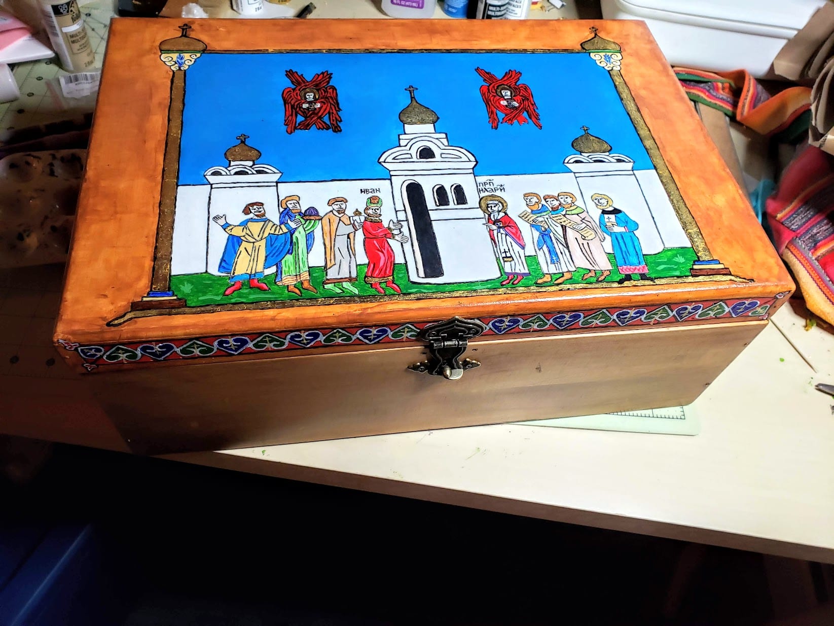
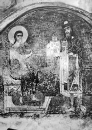
For the decoration on my new box, I had two main inspirations. Firstly, my persona lived in 1050’s Kiev, at a time when the Orthodox Christian church had been the official state religion for less than 100 years (Rus’ was officially Christianized in 988), and when the church was undergoing an enormous period of development. Around this time, Hilarion of Kiev became the first Russian metropolitan archbishop for all of the Rus’ city-states (with the exception of Novgorod, which opposed his appointment), the Grand Princes were establishing the rights of the church as a legal entity (see my translation of Prince Jaroslav’s Law), and many Orthodox churches were being built throughout the land. In the Orthodox church, it was common to see the wealthy patrons celebrated as ktetors, a Greek title meaning “founder” which was appointed to those who provided funds to build or renovate churches. These ktetors were often depicted in murals or other paintings, sometimes with them holding miniature churches representing their title.
My second inspiration was the so-called Radziwiłł Chronicle, a 15th century manuscript of the Povest’ Vremennykh Let or Primary Russian Chronicle, believed to be a copy of a 13th century original. The book’s name comes from the Radziwiłł family of princes who owned the book in Lithuania in the 17th and 18th centuries. Today, the manuscript lives in the Library of the Russian Academy of Sciences in St. Petersburg. The chronicle is famous for its 600 or so illuminations of the Primary Chronicle story. I recently acquired a facsimile copy of the Chronicle from a bookseller in Moscow, and had been wanting to use it as an inspiration for some artwork.

I decided to come up with an image depicting my persona as a Boyar, donating a church to the archbishopric of Kiev. Since I’m not great at drawing, I looked through the book to find several images I liked.


I then used Paint.Net to resize and assemble the pieces I liked into a composite image. I then used a light box to copy this design onto a large piece of paper, and cleaned up the design.

As this was going to be painted on the lid of a chest, I also came up with a design for the side edges of the lid. These were based on some figural Russian illumination designs I had seen used in other manuscripts. Russian manuscripts also often showed architectural elements outlining a central illumination, so inspired by this, I drew a border of pillars and beams around the central design. The church towers and the frames were topped with onion domes, which I planned to gild.

I found an unfinished pine-wood chest at the local craft store. The box was cheaply glued together, so I started by removing the hardware, sanding it, and reinforcing the joints with brass brads. I then stained the box and polyurethaned the bottom and inside to make it water-resistant. The outside edges of the box were then primed to get it ready for painting. I primed the lid with several layers of Zinsser BIN shellac-base primer, and then with multiple coats of a thin parchment-colored acrylic paint that was watered down 75/25. I used painters’ tape and carbon paper to transfer the design onto the box in preparation for painting.

Having been unhappy with the cheap acrylic paints I used on my prior project, I purchased new acrylic paints by Windsor & Newton. I found that these paints still required watering down and multiple coats, but flowed and covered better than the ones I used previously. I started by painting the side panels in red, blue and green.


Once I was happy with the color saturation, I outlined the heart shapes in white and drew the gold crosses on each.

I then started to paint the top lid, which was much easier than the sides as I could lay the lid flat on the table while I worked. I was also getting used to the W&N paints by this point, and painting was going a bit more fluidly. I painted the areas that were to be gilded in red, to give the gold a warm undertone.

As I worked on painting, I felt that the sky was a bit too empty, so I decided to draw in some seraphim (six-winged flaming angels) observing the scene from above. Because I was painting over cerulean blue, I laid down coats of white first, then yellow and red to depict these angels.


Eventually, I was happy with all the painting, and thought it complete and ready for gilding.

The gilding materals on the previous project had been cheap and difficult to work with, so this time around, I read up and purchased some nicer materials from https://www.johnnealbooks.com/. As the sizing, I decided to use a product called InstaColl, an acrylic material that is similar to miniatum, based on reviews that said it was a bit better suited to working on hard surfaces like wood. I started the gilding by “floating” the InstaColl as a nice smooth layer over the areas to be gilt.

The InstaColl was allowed to dry for an hour or so, then I applied 3x-thick gold leaf foil to the area, and burnished with a q-tip to increase the gold’s shine and to remove excess foil. Once the gold had dried, I relined and painted details where needed over the gold.

And, this is where I discovered my mistake — I should have gilded the image first, then painted. When I applied gold to some areas, I found that the gold had a tendency to stick to all kinds of spots that had no InstaColl. This made a bit of a mess that I had to clean up by repainting over, because trying to scrape the gold off with a craft knife just ended up scratching the paint below.

But, as Bob Ross used to say, there are no mistakes, only happy little accidents. I had been a bit unhappy that the seraphim seemed a bit dark and muddy against the blue sky. Despite my attempts to lighten that part of the presentation, they had still looked a drab and un-firey. As I started painting red over the gold, however, I was surprised to find that the result was a great jewel-tone, similar to garnets, with the gold underneath reflecting light through the red paint. As a result, I decided to redo the entire seraphim in gold leaf, then paint red over.


Once the gilding and repainting was complete, I polyurethaned the top to seal and protect the paint, and added the hardware. The original latch had been horrendously modern-looking, so I found a new brass latch online. It had to ship from China, which took a couple weeks, but I really liked it because in shape, it resembled the onion domes in the illumination.

In all, I’m really happy with how this project turned out. I debuted it at the A&S display at Great Northeastern War XXXIII, where it got a lot of positive feedback, although it ended up being dwarfed by an absolutely gorgeous painted triptych that was located next to it on the table. The gilding order was a lesson learned, but led to a pleasant improvement of the final result. The gilding ended up looking amazing on the painting, especially when you view it in the sunlight. And, I enjoyed painting so much, I’m looking into getting egg tempera and trying my hand at some period icon painting.