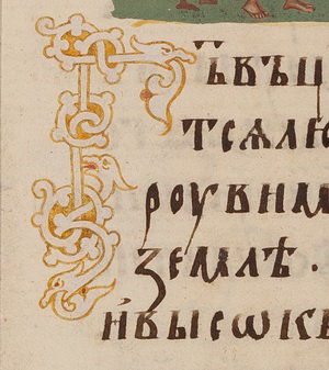
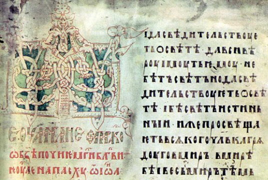
I’ve finished reading the next chapter of Schepkin’s Textbook of Russian Paleography. This chapter starts off slow with an art theory lesson, but picks up considerably a few paragraphs in as it starts to describe the styles of ornament (headpieces and illuminated capitals, primarily) used on Slavonic manuscripts and early printed books from the 9th-19th centuries, including their point of origin (some from Byzantium, Bulgaria, Italy, France and Germany). All of the drawings were in black and white, so I’ve added some fun color pictures from Russian manuscripts to illustrate some of the styles. Miniatures aren’t covered here; they are the subject of the next chapter. Enjoy!
A Textbook of Russian Paleography
Chapter 6: Ornament
A translation of Щепкин, В.Н. «Орнамент.» Учебник русской палеографии. Москва, 1918. с. 42-72. / Schepkin, V.N. “Ornament.” Uchebnik russkoj paleografii. Moscow, 1918. pp. 42-72.
[Translation by John Beebe, known in the Society for Creative Anachronism as Master Ivan Matfeevich Rezansky, OL.]
[Translator’s notes: I’ve done my best to convey both the meaning and style from the original. Comments in square brackets and footnotes labeled “jeb” are my own. This document may contain specialized vocabulary related to embroidery, archeology, Eastern Orthodoxy, or Russian history; see this vocabulary list for assistance with some of these terms. This translation was done for my own personal education, and is provided here as a free resource for members of the Society for Creative Anachronism who may be interested in this topic but are unable to read Russian. I receive no compensation or income for this work. If you like this translation, please take a look at other translations I have made available on my blog.]
[The article in the original Russian can be found here:
https://ru.m.wikipedia.org/wiki/Файл:Щепкин В.Н. Учебник русской палеографии. (1918) — цветной.pdf.]
Medieval Glagolitic and Cyrillic letters are shown in BukyVede font, cf. https://kodeks.uni-bamberg.de/AKSL/Schrift/BukyVede.htm
A Textbook of Russian Paleography
Chapter 1: Goals and Methods
Chapter 2: Old Slavonic Language and the Slavonic Alphabets
Chapter 3: Dialects
Chapter 4: Materials and Writing Tools
Chapter 5: Вязь (Vyaz’)
Chapter 6: Ornament (this post)
Chapter 7: Miniatures
Chapter 8: Watermarks
Chapter 9: Cyrillic Hands
Chapter 10: Russian Hands in Parchment Manuscripts
Chapter 11: South-Slavic Writing
Chapter 12: South-Slavic Influence on Russia
Chapter 13: Russian Poluustav Script
Chapter 14: Skoropis’
Chapter 15: Steganography (Tajnopis’)
Chapter 16: Numbers and Dates
Chapter 17: Verification of Dates
Chapter 18: Descriptions of Manuscripts
Appendix: Slavonic and Russian Chronology
Chapter 6: Ornament
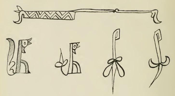
Ornament is a rhythmic visual artform within the confines of empty spaces. Any ornament consists of repetitions, and has a specific frame, be it explicit or implicit. This frame can come in different shapes, from the simplest the most complex.[1]If the frame is implicit, then the ornament’s borders fall more or less along the natural borders of the surface which it covers. Such, for example, are ornaments which cover the margins of a manuscript or tattoos which cover the entire surface of a body. Sometimes, ornament will quite freely follow the natural borders of a surface, in which case they might have their own patterned or complex, implicit borders. In this case, one can speak of the shell (Rus. каркас, karkas) of the ornament. This shell is a solid frame, for example, feudal concrete statues or other buildings. The rhythmic units, or repeating artistic elements, in ornamentation are called motifs. The motif acts upon us as an artistic unit, that is, it gives an impression of artistic unity. But, in its origin, a motif may be either simple or complex; many motifs can be decomposed by our minds into more simple elements – see for example illustration 7, 1, which has an implicit rectangular frame (shown by the dotted line) and consists of a diamond motif. But, the diamonds could be decomposed further into a simple motif of “angles” pointing in different directions. These “angles” are also seen in illustration 7, 2-3. In turn, these angles could be decomposed into an even simpler motif of oblique lines, as seen in illustration 7, 6. Likewise, a straight cross decomposes into vertical and horizontal lines, as seen in illustration 7, 10.
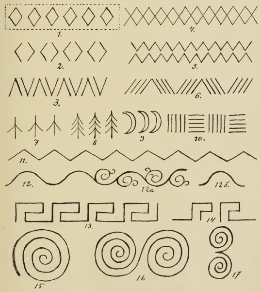
Obviously, the simplest motifs would be just lines, but we also perceive diamonds and crosses as simple artistic motifs. Meanwhile, a cross inside a diamond might be perceived as an aesthetically complex motif. As such, the terms “simple motif” and “complex motif” have one meaning for aesthetic analysis, and another for genetic analysis. Take for example illustration 7, 4: genetically it is, at any rate, complex, but aesthetically it could be perceived as either a simple or as a complex motif: “two intersecting zigzag lines” (in the case where the two lines are of different colors), or as a simple pattern of “diamonds.” But, the same motif might be understood genetically as “two zigzags running side by side” (compare to illustration 7, 5, again considering the case where the two zigzag lines are of different colors). From this, we can see that doubling a motif can create a new motif which is at the same time simple in an aesthetic sense. This combination of motifs occurs in ornamentation quite independent of nature, based on instincts of symmetry and rhythm. But genetic analysis proceeds from the observation that the majority of motifs (as well as borders) are either borrowed from nature, such as the crescent moons in illustration 7, 9, the duck’s feet in illustration 7, 7, the herringbone design (Rus. ёлочка, jolochka, “herringbone” or “small fir tree”) in illustration 7, 8, etc. Or, they may come not from nature, but from Euclidian geometry, with simple symbols based on the most general of spatial concepts: dots, lines, and combinations of these symbols, such as angles, triangles, quadrangles, etc. As such, in ornament, two artistic principles are embodied: the natural and the geometrical. And just as the technical implementation of a given principle in art is called a style, we usually also distinguish between a natural style and a geometric style of ornament. We note here that stylization is what we call the conformance of artistic material to a given principle. A style may be clearly expressed, embedded in forms, and yet not subjugated to those forms, that is, only combining them and yet retaining a certain independence (which might occur in either the natural or geometric styles). A style may also subjugate these forms, that is, modify them according to its own principles, for example, vegetative motifs might be geometrically stylized. As such, ornament may be styled or stylized. In modern art, the words style and stylization are incorrectly used to mean a strongly conveyed manner, but a manner is the application of a single technique, not a principle, which always gives rise to multiple techniques; as such, a manner differs from a style in its use by chance and its monotony.
In ornament, we also encounter man-made designs, for example, chains, bundles, folk weaving, or the lector’s fasces (a bundle of rods with an axe in the center) in Roman and later ornamentation. Sometimes these are individual motifs, and do not combine into an overall style or rise to the level of classification; however, such motifs as bundles and weaving may comprise a style conforming to the principle of ornament, and embodied in quite diverse manifestations. As such, depictions of bundles or weaving might range from rough naturalism to geometric abstractionism. However, man-made creations are found in ornament decidedly infrequently as motifs and even less frequently constitute a style. As a result, we choose not to create a third classification for these, and will limit ourselves only to indicate where images of man-made creation appear in a particular ornament, and what place those images occupy in the different timeframes alongside the natural and geometric styles. Natural motifs may also appear in vary different levels of generalization; for example, a herringbone borders on the abstraction of the geometric style. But even this motif never becomes fully (mathematically) abstracted in its elements.

Ornamental dots and lines are associated with ideas of human labor, including some units of work such as the wedge (?, Rus. укол, ukol, “puncture, injection, split”), straight or broken notches, or swings (for example, with a stick, a sling, or a stone on a rope), creating straight lines, arcs, circles, etc. This is why a rhombus does not decompose into the elements of “slanted lines” or “three line brackets,” but only into “two angles.” By the same principle, a circle doesn’t decompose into two semicircles, into four equal arcs, two unequal arcs, or into an abstract concept of an infinite series of points. The crescent, fir-tree, and duck’s foot likewise do not decompose via genetic analysis (into two arcs, straight lines, or angles), because these motifs are directly associated not with units of labor, but with external phenomena. These motifs can be decomposed only by technical analysis, that is, not by “how they came to be,” but “how to create them.” Technical analysis has its own unit, which is not called a motif, but rather a pattern (Rus. рапорт, ráport, “report,” from French rapport); it also has its own basis, which is not called a frame or shell, but rather a grid (Rus. сетка, setka, “net”). Grids may be straight or oblique, as well as complex; individual cells may be square or non-square (triangular, rectangular, diamond-shaped). The pattern is that part of the design which repeats, that is, the minimum (practically, not aesthetically) which is necessary or most beneficial as an exemplar to reproduce the pattern multiple times. The word pattern is used in manufacturing for patterns on rectangular surfaces: wallpaper, cloth, etc.; but the same term can also be successfully applied to the scientific analysis of ornament. Ornament may be divisible or indivisible, that is, discontinuous or continuous. A motif cannot be separated out from a continuous ornament, we are only able to distinguish the pattern. For example, the wavy line (Rus. змейка, zmejka, “little snake”) in illustration 7, 12 is made up of the pattern 12б, but the aesthetic impression of the wavy line does not decompose into the aesthetic impression of excerpt 12b. Likewise, the simple meander in illustration 7, 13 obviously consists of repeated known aesthetic elements, but these elements cannot be separated from one another. The “pattern” of such a meander gives only an unaesthetic impression of a “fragment” (illustration 7, 14). If one draws out the pattern of such a meander alternating in blue and red pencil, it is possible to discern the aesthetic impression of the ornament only by ignoring the colors. Continuous ornament consists of rhythmic exchanges of two or more separable motifs. Continuous ornament might be natural or geometrical in origin; compare the creeping vine in illustration 7, 12a and the zigzag in illustration 7, 11. A spiral (illustration 7, 15) is a simple uninterrupted motif, which can become discontinuous when doubled (illustration 7, 16-17). A spiral can be traced in its origin both to both the natural and geometrical styles. As such, ornament is differentiated 1) by the content of its motifs, 2) by the way it combines those motifs, and 3) by the character of its frame. These are the three essential features of any ornament, and should be the basis of our scientific definition. Limiting ourselves to the above analysis, let us move on to a presentation of data.
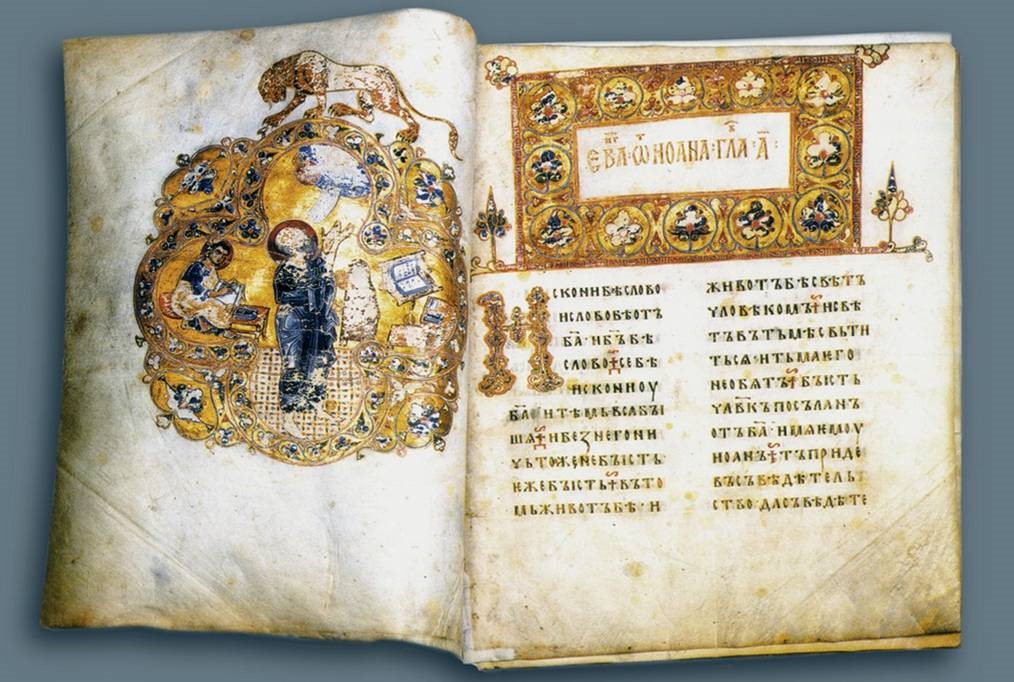
Among the South Slavs and in Russia, the spread of Byzantine art, including ornamentation, was associated with that of Christianity and writing. This Byzantine influence was almost exclusive in the ornament of manuscripts; other artistic influences arose in written works rarely and later. The ornament of manuscripts is divided into headpieces (Rus. заставка, zastavka)[2]jeb: Interestingly, this word is used modernly to mean “splash screen”! and illustrated capitals (Rus. инициал, initsial). A headpiece (the word “заставица”/“zastavitsa” is found as early as the 1092 Arkhangel’sk Gospel) is a page-width decoration before the beginning of a large section of text. A capital is a decorated letter at the beginning of a large section of text. In early years, the headpiece often served as a frame for an inscribed title. Only in the second half of the 17th century, based on Western examples, do we see the appearance of frame-like headpieces occupying the entire surface of a title page.[3]These are called a frontispice, to use the medieval French terminology. There also exist decorations at the end of a section,[4]A cul de lampe, to use the medieval French terminology. In modern typographic art, such ornament is called a kontsovka (Rus. концковка, from конец/konets, “end”), recently borrowed from the Polish (koncowka). Medieval Slavic calligraphy used the word ruka (Rus. рука, “hand”) to indicate a common type of kontsovka: the written text on the last page tapers toward the bottom, where it is enclosed by a forked branch held by a clasped hand. and decorations in the margins at the beginning of a section of text.[5]In later Old Believer calligraphy, these marginalia are called a “flower” (Rus. цветок, tsvetok), as in 18th and 19th century manuscripts they were vegetative in character. All of these should be considered separate from headpieces; in the medieval period, end and margin decorations were simple and underdeveloped. The latter served to direct attention to the start of a section which was poorly set off in the text itself (e.g. the beginning of a secondary section might be noted by a small headpiece, an initial, or by nothing at all).
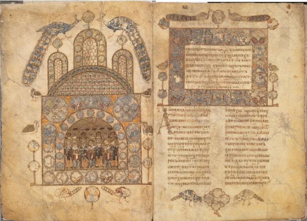
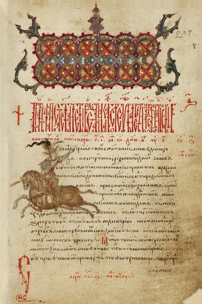
Byzantine ornament had one distinctive trait: its frames were composed exclusively of basic architectural motifs, that is, those simplest of geometrical forms which existed in late antiquity architecture: rectangles, arches, circles, triangles, etc. It is necessary in Byzantine manuscripts to distinguish between small and large headpieces. Small headpieces were adopted by the Byzantines from late antiquity calligraphy and consisted primarily of the simplest of natural and geometrical motifs: wavy vines, curvy lines, zig-zags, small semi-circles, small angles, chains, alternating dashes (vertical, horizontal, or slanted in various directions), etc. The frames of these small headpieces were implicit, in the form of narrow rectangular stripes. Simple branches were frequently placed at the ends of these small headpieces. These headpieces, which varied little, existed in this form throughout the entire period of Byzantine art, occupying positions at the beginning of secondary sections of text. Narrow bands of braid and weaving were also used in the same location, borrowed directly from the patterned mosaics of the Christian period. Both of these forms transferred to the South Slavs and to the Russians, in modest manuscripts, and in the secondary level texts of sumptuous manuscripts. Large headpieces arose in Byzantium itself to indicate the major sections of manuscripts, especially in luxurious manuscripts. This began in the late 9th-early 10th centuries, when the state’s power was at its height and (which is of particular importance for us) at the same time as the appearance of Slavonic writing. The large headpieces in rank-and-file manuscripts were not very significant in size, and contained either combinations of the simplest “branch-like” vegetative motifs (manuscripts of Arabian origin – see illustration 8), or of knotwork (manuscripts of early-Christian origin), which we see carried over on Slavonic soil in Glagolitic manuscripts (Macedonian and Croatian). In luxurious manuscripts, these headpieces took on a new and particular style, the so-called Byzantine Style, par excellence. In Slavonic works, this was adopted in the luxurious manuscripts of Cyrillic writing (Old Bulgarian/Old Church Slavonic, and Old Russian). Large headpieces of this Byzantine Style have large explicit frames (see illustration 16), initially in the form of a short rectangle, often with a smaller rectangle inside it which contained an inscription or title; if not, then the headpiece was broken up into simple geometric forms. Starting in the 10th century (but little used until the late 10th century), there appeared headpieces with a rectangular cutout at the bottom (for inscriptions), as well as a similar type with semi-circular cutouts. Both types could also be decorated internally using the same method as the older rectangular form. In the late 10th-early 11th centuries, there appears a rectangular type positioned on columns; between these columns would be written titles or other inscriptions. Starting in the 12th century, semicircular cutouts began to take up more than half of the surrounding area; in the 13th century, they started to be broken up and accentuated. For the most part, the types of headpieces from earlier centuries continued to exist alongside these newer ones (see illustration 9).
Let us move on to an analysis of the motifs of large headpieces. At either end of these headpieces, we might find leaflets, flower buds, flowers, or branches. Sometimes on either side there might be larger branches or entire stylized plants. All of these decorations emerge out of the headpiece, that is, they are not separated from it. The headpiece itself sometimes contained scenic images, for example, the face of Christ inside a circular frame; but generally speaking, this was rare. More often, the tops of headpieces would contain realistic-artistic images of animals. An ancient motif from Roman mosaic was quite frequently used in this regard: two birds on either side of a cistern, urn, or plant. All of these forms of large Byzantine headpieces at first transferred over to the South Slavs, then later into Russia, where they would mostly take effect about a century later. The background (Rus. фон, fon) for these large headpieces was typically gold in luxurious manuscripts, on top of which stylized stemmed plants and flowers were painted inside internal partitions or cells (Rus. перегородка, peregorodka). The predominant colors were white, light blue, and pink, and green for leaves. Starting in the 12th century, less luxurious manuscripts featured combinations of (previously seen) branch motifs (illustration 8), painted against colorful backgrounds or without a background. Even simpler Greek manuscripts (starting from the 10th century) include large headpieces consisting of knotwork (Rus. жгут и плетене, zhgut y pletene, “plaits and braids”) inside rectangular frames, sometimes implicit and sometimes explicit. This knotwork was borrowed from early Christian artwork, where it was used in both carvings and mosaics. Starting in the 11th century, the quantity of these knotwork headpieces increased among the Byzantines. In turn, this Byzantine knotwork was adopted by the Slavs, among whom in the earliest times it was particularly common in Glagolitic manuscripts.
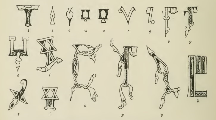
The Greek alphabet is fundamentally geometric, as it consists of a combination of straight lines and arcs; as such, the frames of Byzantine capitals, as with the headpieces, represented basic architectural forms. Byzantine capitals evolved at the same time as their large headpieces. In these capitals, the borders could be explicit and fulfilled using geometric motifs, vegetative motifs, or knotwork. The frames of capitals were also often implicit, and in addition to stylized plant motifs, their natural motifs often presented realistic-artistic images of plants, animals, and human beings (or their parts), in combinations that left the basic shape of the letter intact or mostly intact such that they can still be made out even when looking at them from a distance. Accordingly, the letter is used as the skeleton of the image. As a few examples: an а appears as a tree trunk, with a woodpecker pecking the left side of the trunk, sometimes with a snake emerging from the trunk to swallow the woodpecker; a в is shown as a snake on a tree trunk, with two large curves and the trunk forming the letter; in the letter е, the tongue is in the form of a hand performing a blessing; и, м, п are shown as two people whose extremities touch in various ways; л, х, ч (that is, υ) have snake heads atop raised bodies; ч as a small tree with two birds atop it with their heads separated; ч as two snakes, with their tails entwined and their heads aloft facing one another; ф in the form of an ear with two leaves bent downwards; a т in the form of a fox salesman, carrying two roosters suspended from a pole; a ꙍ in the form of a flower with a bird on each of two side branches; etc. (see illustration 10).

Illustration 10: Byzantine capitals. Illustration 11: Headpieces and capitals from the Savvina Kniga. Illustration 12: Capitals from the Glagolitic Sinai Missal
When Byzantine ornament transferred to the Slavs along the invention of writing, there arose in the major Slavonic centers quite accurate emulations of the Byzantine style, as attested by Russian copies of East-Bulgarian manuscripts dating to the 10th century: the Ostromir Gospel from 1056-1057, and the Svyatoslav Izbornik (or, more accurately, that of Simeon I of Bulgaria) from 1073. The same Byzantine style of headpieces and capitals is also found in the pre-Mongolian period in later, sumptuous manuscripts, for example the Mstislav Gospel (written around 1115-1117) and other undated Russian examples written up through the early 13th century inclusive. But, neither the basic principles of Byzantine ornament, nor its high technique was able to hold out for long against the entire mass of Slavonic writers and copyists. Local artisans were in general located further from the Byzantine originals than the calligraphers of Preslav, Kiev, and Novgorod. These folk artisans simplified works of the Byzantine style, mixing folk-fantastic motifs into it, and in capitals they sometimes violated the skeletons of the letters. The same phenomena are also found, although not very frequently, in provincial Byzantine manuscripts, and the ornament in these works also were able to influence the Slavs (for example, in the monasteries of Mt. Athos and generally in the sphere of direct influence from the Greek church). This continued the ornament of this simplified and rough, but in principle nevertheless Byzantine style, as all the motifs were of Byzantine origin, the violations of the skeletons in capital letters were not very significant, and no new general principles arose from these changes. This type of ornament is called the Barbarian Variety of the Byzantine Style, as well as the Transitional Style. It is called this because it does not represent the true style, but at the same time represents a transition from the Byzantine Style to the teratological style, which will be described below. The Old Church Slavonic Savvina Kniga (“Savva’s Book”) is a characteristic work of this Barbarian Style: the roughly drawn and small headpieces are composed of narrow rows of knotwork or simple geometric motifs. Sometimes on the edges of these headpieces, instead of a branch, we’ll see a simplified snout with ears, and the capitals from the same manuscript include fantastic animals and plants (see illustration 11, the initials в and р). Several characteristics associate this to the Barbarian style: simple misunderstandings of the details of the Byzantine motifs, and the roughening of the picture during copying. We also see a tendency to turn plant forms into animal forms, a simple folk technique seen in the drawing of eyes, ears, and tails, knotwork turned into a snake, and branches turned into animals. Glagolitic manuscripts from the 11th century abound in knotwork, but Glagolitic capitals, with their strange outlines, directly introduced vaguely-fantastic concepts (see illustration 12). These and others crossed over into Cyrillic copies. This “barbaric” manner must have already existed in the Bulgarian regions in the 10th century, for we find it in the so-called 13 Sermons of Gregory the Theologian (Rus. 13 Слов Григория Богослова, 13 slov Grigorija Bogoslova), an 11th century Russian copy of an Old Church Slavonic original. It is apparent that the ornament in this manuscript was simply copied over into the Russian example, as the development of the Barbarian style did not start in Rus’ until the 12th century. This “barbaric style” in 12th century Rus’ was not of such a rough, folk manner as we find for example in the 11th-century Old Slavonic Savvina Kniga.

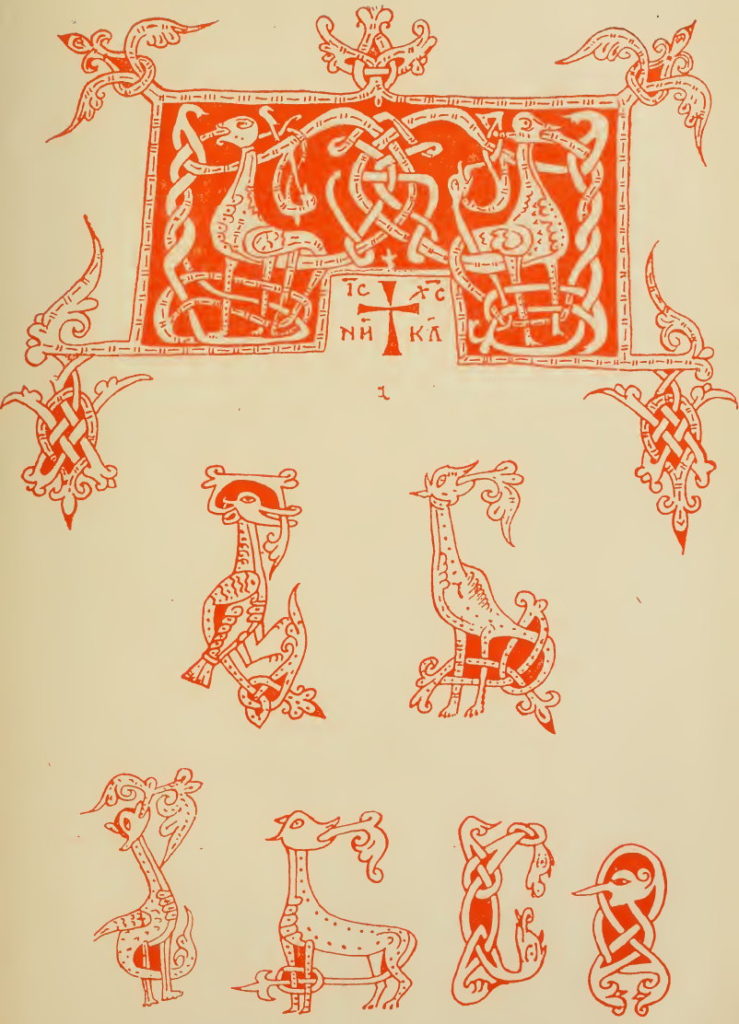
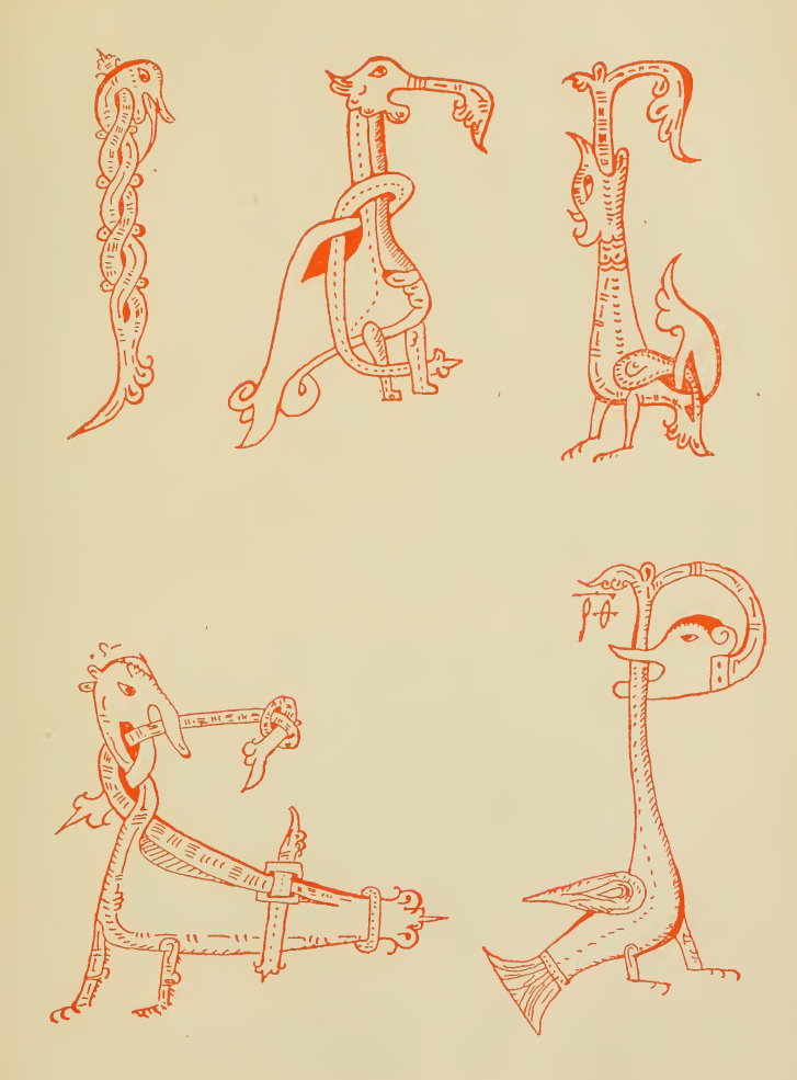
The Teratological Style[6]cf. Greek téras, “beast;” the term “teratological style” was introduced in Buslaev’s Sochinenija po arkheologii i istorii iskusstva (“Essays on Archeology and Art History”). evolved in capital letters in Rus’ and should be studied in its own right. Teratological capitals principally differ from Byzantine capitals in their repudiation of geometric frames and skeletons. This is the first essential feature of teratology.[7]jeb: teratology: mythology relating to fantastic creatures and monsters. The transitional manner preserved both the frames and skeletons, differing from the Byzantine Style primarily by starting to rework the motifs. Teratological capitals, having inherited and developed the motifs from the transitional period, gave the motifs of “living creatures” (snakes, birds, quadrupeds, and later, human beings) not only a quite free, but also an outright substantive meaning, that is, it turned them into a certain type of miniature, as a result of which the letter, even at a distance, became unrecognizable, or recognizable only with difficulty. This nebulous character of the capital brought to life a new technique: Novgorodian teratological capitals from the 14th century often depicted the outline of the letter not as the figure itself, but as its background; for example, the letter Б might be seen as a bright blue blob, with a teratological figure painted over it. The second essential feature of teratology is that the old motifs of living beings, knotwork, and vegetative designs, which earlier were discretely separated, now merged together, forming fantastic images. Let us explain this with an example: the Byzantine capital р consisted of a trunk and a semicircle. This frame could be implicit or explicit. In the former case, a strip of knotwork might be painted on the trunk, or the semicircle might contain a human face. Or, the trunk might be preserved, but the semicircle might be painted as a curving branch. A transitional letter р consisted of a trunk, but the branch at the top might have eyes and ears, transforming it into the face of an animal. A teratological capital р might be depicted in the form of a standing human with a tail in the form of a branch, a knotwork body, and with a small head. This type of р might be indistinguishable from the letter і. Or, the teratological capital might depict the р as a monstrous bird, with the tail and wings below and curving to the left; its incredibly long neck reaches upward, and having let go of a branch, makes a loop to the right. Its monstrous face is turned backwards, attempting to gnaw upon its own neck.[8]Individual teratological motifs (that is, individual occurrences of these inseparable combinations of motifs of living beings, plants, and knotwork) are found in Rus’ as early as the 12th century. But, these rare occurrences did not yet represent an overall style of ornament, that is, a general principle.
Teratology formed slightly earlier among the Bulgarians and, according to historical conditions, formed into two regional categories: folk and technical teratology. Both categories arose most likely in the 12th century, flourished in the 13th century, and started to subside in the 14th century. Folk teratology developed in Macedonia, where Slavonic writing in the 12th-14th centuries lacked any large, permanent center. Technical teratology arose in Eastern Bulgaria, and from there starting in the 13th century began to cross over into Rus’ without displacing either the Byzantine Stile or the Transitional Manner. Both categories of Bulgarian teratology shared the lack of frames and frameworks, as well as the joining of motifs, but were sharply differentiated by the content of their motifs. Folk teratology was based on folk designs from the transitional style: motifs of eyes, ears, tails which would weave together into snakes, and branches which would turn into long-eared animal muzzles. Snake motifs were predominant, used in both capitals and headpieces. Only in the second half of the 13th century do we start to see folk teratological capitals with birds (in rough forms), which were borrowed from the technical or eastern-Bulgarian teratology. Technical teratology was based on capitals which contained knotwork, plant, and animal motifs, as a result of which it developed primarily in the capital letters Б, В, Г, and Р, which were encountered most frequently in decorated Slavonic church books (Gospels, Acts, Psalters). Unlike the Byzantine and Transitional Styles, which used their motifs separately and in moderation, technical teratology used them in inseparable, complex combinations. A typical capital from the technical teratological style presents as a bird or an animal (quadruped) with foliage emerging from its mouth, and with a tail (or if a bird, its wings) which becomes entangled in knotwork. Technical-style teratological headpieces formed from a symmetric combination of two of these initials, forming a generally rectangular frame with woven knots on either end and in the top center. This technical teratology assumes there were more skilled scribes, and as a result, more luxurious manuscripts and larger cultural centers which, taken all together, were found once again in Eastern Bulgaria starting in the late 12th century (the Second Bulgarian Empire). However, no Eastern Bulgarian manuscripts from this time have survived to modern day. We can posit this Eastern Bulgarian technical teratology based on copies, including Russian manuscripts from the 13th century, and the Macedonian Psalterium Bononiense (Rus. Болонская псалтырь, Bolonskaja psaltyr’, “Bolognese Psalter”) written in Okhrid around the same time (1230-1241) when the area was ruled by Emperor Ivan Asen II of Eastern Bulgaria. These copies are similar not only in their motifs and the overall schemes of their capitals, but also in their use of color: they use red, green, and yellow paints, sometimes individually, and sometimes in combinations of two or all three at the same time. In the 14th century in Eastern Bulgaria, two styles were in use at the same time: the Neo-Byzantine Style, and the so-called Balkan or Knotwork Style, in use by the entirety of provincial and folk calligraphers. Both of these styles were borrowed from Byzantium, where they became trendy in the 13th century. Both styles are described below, with regard to their transition to Russia. In the mid-14th century, at the court of the book-loving Emperor Ivan Alexander, there appeared exquisite illuminated manuscripts (preserved even until today), of which one, the so-called Tomić Psalter (Rus. Псалтырь Томича, Psaltyr’ Tomicha), contains this type of ornament. In its headpieces, the neo-Byzantine style is predominant (both pure and with local influence), while its capitals contain two alternating styles: the neo-Byzantine, and another highly-artistic style combining Byzantine and Western elements into a unified teratological style with motifs of beautiful snake heads holding branches in their mouths.
Plate 5: Headpiece and capitals from the Psalterium Bononiense, 13th century. Plate 6: Capitals from the Psalterium Bononiense, 13th century.
In 13th century Russia, the Bulgarian technical teratological style predominated in the use of motifs and coloring, and as such, the colors red, yellow, and green (at once, or separately) were common. But, starting in the late 13th century,[9]The Rumjantsevskaya Psalter from the 1270s is similar in the drawings and coloration of its ornament to the 13th century Psalterium Bononiense; but at the same time, this 1270s Psalter contains the first accurately dated examples of the following phenomena in Russian teratology: 1) the motif of a bird with a human head in profile; 2) capitals where the shape of the background but not of the drawing atop it match the intended letter; 3) light blue paint used on capitals. there appeared in Russia another, more harmonic coloration: achromatic drawings (of the same style as before) with red (cinnabar) outlines and light shading in yellow, appearing against blue-green, bright blue, or (starting in the 14th century) peaceful dark-blue backgrounds. The latter coloration is justly considered a predominant characteristic of manuscripts from the 14th-century Novgorod region. Manuscripts from Pskov and 14th-centiury Western Russia, as well as a Muscovite gospel from 1339 (the Siysky Gospel, Rus. Сийское евангелие, Sijskoe evangelie) represent a struggle between the old Bulgarian coloring and the new Novgorodian style; for example, manuscripts from Ryazan’ with teratological ornament never have blue-grey backgrounds, and instead are typically green. The Ryazan’ region is also significant in that it continued to use teratological ornament into the 15th and 16th centuries, while to their north and south (aside from an insignificant number of examples) the style disappears in the early 15th century under pressure from the South Slavic influence. Starting in the 14th century, in capitals and then later in headpieces, Russian manuscripts start to include entire (that is, having extremeties) profile human figures in the teratological style. This new motif did not exist in Bulgarian technological teratology. In Byzantine and Traditional ornament, we see capitals with human faces inside the loops of letters or with solid but independent human figures. In teratology, “linked” human figures (inextricably woven into the knotwork) appear in Russia only starting from the early 14th century.
The South Slavic influence supplanted teratology in the Western-Russian, Muscovite, and Novgorod kingdom in the early 15th century. Instead, two styles of ornament began to spread in use: the neo-Byzantine, and the Balkan. In Novgorod, Moscow, and other main centers of Great Russian life, Byzantine ornament began to gradually take root; it consisted of stylized vegetation against a gold background, within geometric frames. This ornament, adopted from Bulgaria and Byzantium, was only slightly different in its details from the older Byzantine ornament of the same character (for example, the inner partitions of frames became more complex, and in Russia we also often see the influence of newer, western circular designs), and is typically called neo-Byzantine ornament. Very few examples of Russian manuscripts of this style have survived from the 15th century, but in the 16th century it was predominant in luxurious manuscripts from the Muscovite state. In the period of Ivan the Terrible, the neo-Byzantine style became the style of the upper classes in Moscow and Novgorod.
In Western and South Western Russia, as well as in Muscovy itself, in the 14th century, knotwork ornament was predominant; in light of its widespread use among the Southern Slavs and Romanians in the 14th and 15th centuries, this form is also called the Balkan Style of Ornament. This form of ornament used knotwork proper, woven bands, knots composed of circles, infinite figure-eights, et.al. Sometimes the frameworks of these weavings were depicted realistically, sometimes geometrically. In simpler manuscripts these contoured patterns were worked in cinnabar; in more luxurious manuscripts, a quite motley coloring was predominant, with a tendency toward the Bulgarian tones: red, yellow, and green. As has been said above, in the 15th century this style was also quite widely used in Great Russian manuscripts, just as the neo-Byzantine style was just taking root, starting with the Bulgarian variant, then with the more severe examples coming from Byzantium.
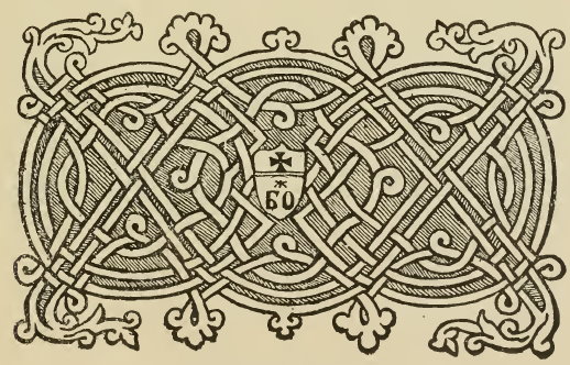
The Balkan style was also predominant in manuscripts from Western and South-Western Rus’ in the 16th century, and as a result in luxurious manuscripts from this time period and area we find the most beautiful knotwork of Romanian origin on gold backgrounds, rather than the folk Bulgarian style. In the 16th century, in South-Western manuscripts we also sometimes find purely Italian ornament from the “High Renaissance”.
In the Muscovite state, under the influence of ornament from Muscovite printed books from the 16th century, we start to find “seals” (Rus. клеймо, klejmó, “hallmark”) or patterned frames in the so-called Old Printed Style (Rus. старопечатный стиль, staropechatnyj stil’), consisting primarily of large vegetative designs, sometimes with stylized fruit or flowers, worked in black paint. By their style, these vegetative motifs belong to the ornament of the German Renaissance. During Ivan the Terrible’s reign, starting in the 1560s, this was how both luxurious and amateur copies of books were decorated. But during the restoration of book printing in Moscow under Feodor I Ivanovich and Boris Godunov (1584-1605), the neo-Byzantine style with Old Printed seals became quite a common fashion.
After the Time of Troubles, the Byzantine style quickly disappeared, and the Old Printed style began to predominate in both headpieces and capitals. The Old Printed style was the main Russian style for the 17th century. In this, we find two sorts of coloration: 1) white greenery against a black field worked in an engraved manner, that is, with light shading, and sometimes with a few lines of gold or cinnabar; or vice versa, with a white field and black greenery ; in both cases, as in Old Printed books, one of the primary colors was black, and the white sections of the design are just the unpainted surface of the paper. 2) The same greenery as in the Old Printed style in white, black, gold or a colored field, while the greenery is lightly or completely colored in various colors. Both types of coloration arrived in the 17th century, but the more colorful style prevailed in the 18th century. At the very end of the 17th century and in the early 18th century, books were printed on special sheets and sold as headpiece-frames (either as full pages or quarter pages) with fine greenery patterns in the same Old Printed style. Such pages were pasted into manuscripts as title pages.
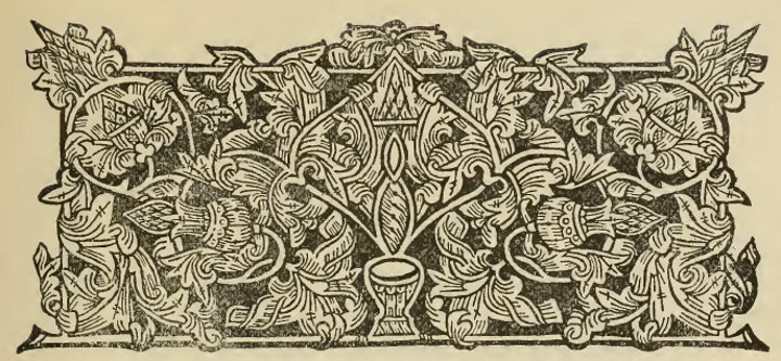
In Old Printed style books whose ornament served as examples for manuscripts, the headpieces of the primary divisions of the book had rectangular frames, while those for secondary-level divisions often consistent of vegetation rising freely upwards from a horizontal line which served as their foundation. Starting in the mid 17th century, Russian manuscripts contained loose vegetation in the form of primary headpieces (see illustration 18).
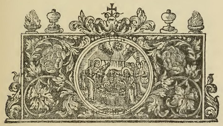
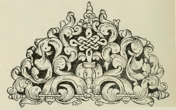
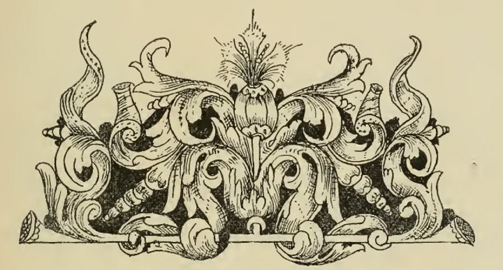
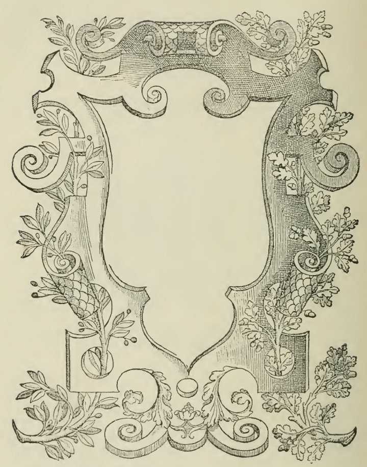
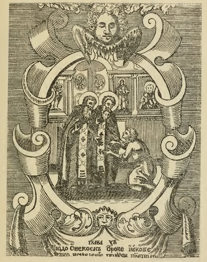
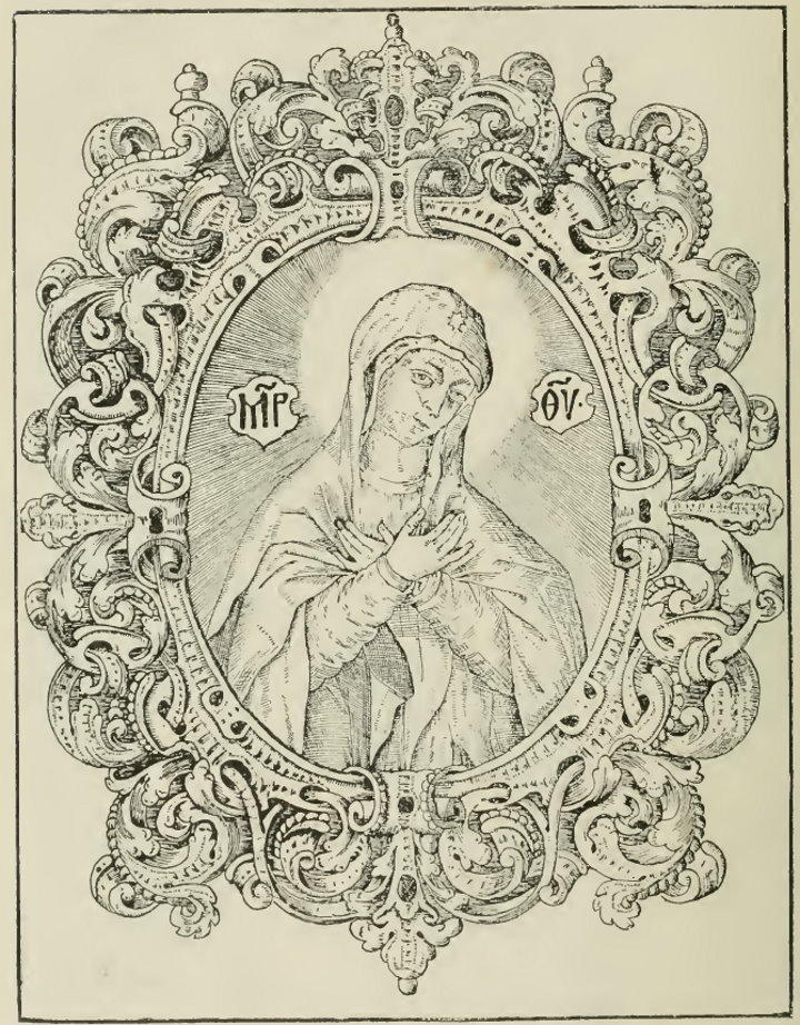
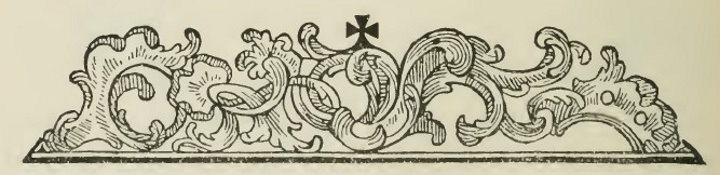
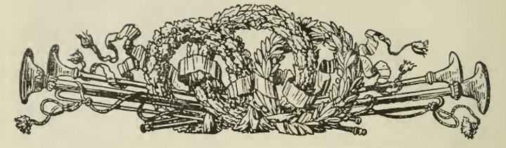
But along with this Old Printed greenery, starting in the second half of the 17th century, in the headpieces and capitals of the Muscovite empire, Baroque style ornament also appeared – that is, Western 17th century ornament. This style emerged in Italy in the 16th century (see illustrations 18, 19), but arrived in Russia in its German and Polish variants, and in the second half of the 17th century became popular at the Muscovite court and with the Patriarch, and is see in several luxurious manuscripts decorated by foreigners or their Russian disciples. The Baroque style can include various plant motifs, as well as depictions of real plants: leaves, flowers, fruit, but only inextricably combined with motifs of higher (analytic) geometry: ellipses, spirals, as well as their parts, with their favored broken turns. From a practical point of view, these were patterns whose essence consisted of the curves and broken lines found on a curve (Rus. лекало, lekalo); a curve is a special kind of pattern template, which is also used by modern technical draftsmen). These were the same patterns which appeared in the West in the late 16th and throughout the 17th century in the decoration of architectural details: pediments, cornices, jambs, as well as in all forms of artistic production, including modeling, sculpture, carvings, chasing, etc. The Baroque predominated throughout the course of the 17th century in Poland, and in South Russian and West Russian Old Printed works. In Moscow, the pure or Western Baroque, having appeared in the mid 17th century, became the new fashion of the upper class. From this pure or Western style of Baroque, however, a hybrid or Moscow style of Baroque should be distinguished. Just as from the beginning of Muscovite book printing, seals of Old Printed greenery would erupt from the middle of neo-Byzantine headpieces, thus too starting from the mid-17th century, in Moscow, various Baroque motifs would appear in Old Printed vegetative headpieces. at first, this was observed in Muscovite printed works: in the headpieces in these works, sacred images appear inside elliptical or patterned Baroque-style seals, or the mannered lines of the Baroque style were intertwined with the headpiece’s greenery. Toward the end of the century, this mixing became generally widespread in Great Russian manuscripts. In royal and Patriarchal manuscripts from the second half of the 17th century, this mixed or Moscow Baroque (Rus. Московское барокко, Moskovskoe barokko) had a sumptuous variant. Gold joined the black and colored paint: on one and the same headpiece, worked out against the field in Baroque mannered lines and having a seal in the center, we find white or multicolored vegetation against a gold field, or gold and white greenery against a black or painted ground. Directly from this luxurious variant of Moscow Baroque, there emerged a somewhat simplified but very similar Pomor Style (Rus. поморский стиль, pomorskij stil’) of ornament, which flourished in Old Believer calligraphy in the North and East of Russia throughout the 18th and 19th centuries. The Pomor Style is distinct: a gold ground and white or multi-colored plants, crossed by frilly lines. A simple form of Moscow Baroque continued to live alongside the Pomor Style throughout the 18th century. In general, in the 18th century, the Baroque style was more popular in Russian manuscripts than the Old Printed style. Alongside the stylized Old Printed style of greenery, there appeared in Russia in the 18th century the more realistic 18th century German style of greenery, sometimes large and fluffy, sometimes small-leaved. The taste for the Baroque style was maintained in 18th century Russia by numerous works of ecclesiastical printing, which spread out over the entire country.
Illustration 18: From a Russian manuscript, 2nd half of the 17th century (Sobranie rukopisej E. V. Barsova, II, 5). Old Printed style with a holdover of Balkan knotwork. Illustration 19: From a Russian manuscript, 2nd half of the 17th century (Sobranie rukopisej E.V. Barsova, II, 5). Old Printed style with Baroque elements. Illustration 20: Italian title page, mid 16th century, engraved by Sebastiano Serlio (died 1552). Illustration 21: Sts. Zosima and Savvatiy, with their Acts. Russian engraving, mid 18th century. Rough Baroque of Dutch origin. Illustration 22: Russian engraving, late 17th, early 18th century. Example of luxurious Moscow Baroque from this time. Illustration 23: From Le Clerc, M., Histoire de la Russie ancienne, 1783. Transition from Rococo to Louis XVI style (the same headpiece is also seen in French books from the 18th century).
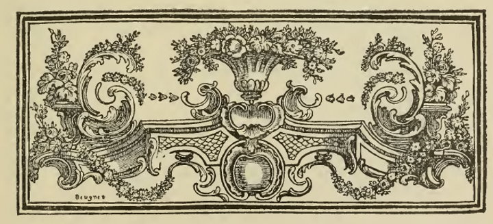
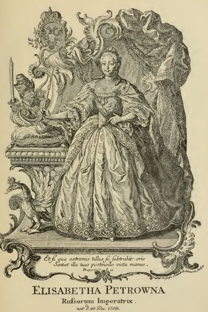
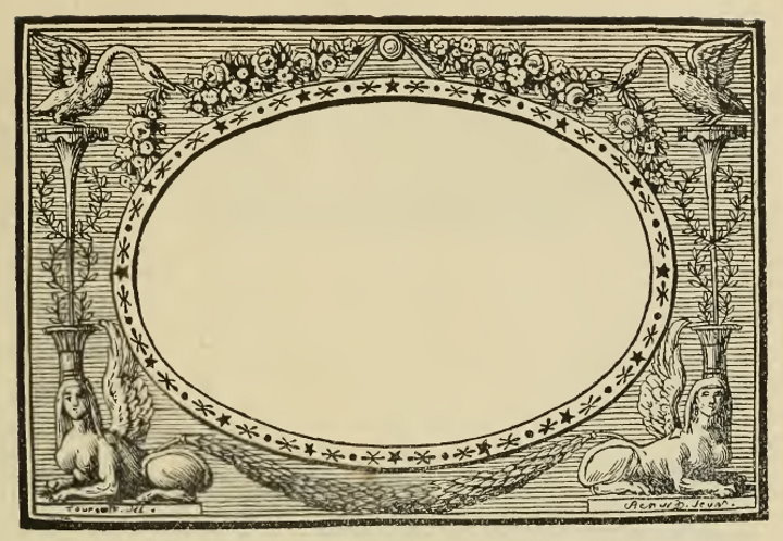
In the 18th century, France was the source of great ornamental creativity. French ornamental styles are typically named for the reign when they were created, with the 18th century including the Regency, Louis XV, and Louis XVI styles. The final original French stile was the Empire style, or the style of the Empire of Napoleon I. The French styles of ornament which penetrated the upper classes of Russian society are relatively poorly reflected in those manuscripts which served only the uneducated classes. French 18th century styles also include Rococo (Rus. стиль рококо, stil’ rokoko). Rococo consists of various combinations of a single motif, which is taken from a shell seen in profile, generally resembling a human ear.[10]This motif clearly appears in the Regency style and (especially) in the Louis XV style. The basis of this motif grew under the hand of such artisans as the jeweler and decorator Juste Aurelle Meissonier (died, 1750), whom his contemporaries considered to be the inventor of the Rococo style. The established Rococo style, in a less artistic but more typical form, was especially widespread in Germany. Rococo did not use explicit frames, and only half-heartedly, like a creeping vine, stuck to the natural borders of its surface (the pages of a book, windows, doors, gates, and the contours of all kinds of furniture and utensils), forming an asymmetric seal that was elliptical, oval, or pear-shaped. In Russia, the Rococo style appeared starting during Elizabeth Petrovna’s reign (1741-1761) in the everyday settings of the upper class. Rococo was widely used before and during Catherine II’s reign, and during this time, it also arose in printed church books, where it began to unite with previous stages of ornament: Old Printed-style vegetation and Baroque-style lines (see illus. 26). A bit later, Rococo appeared in Church printing in a more pure but rough form, pointing back to German sources (see illus. 27).
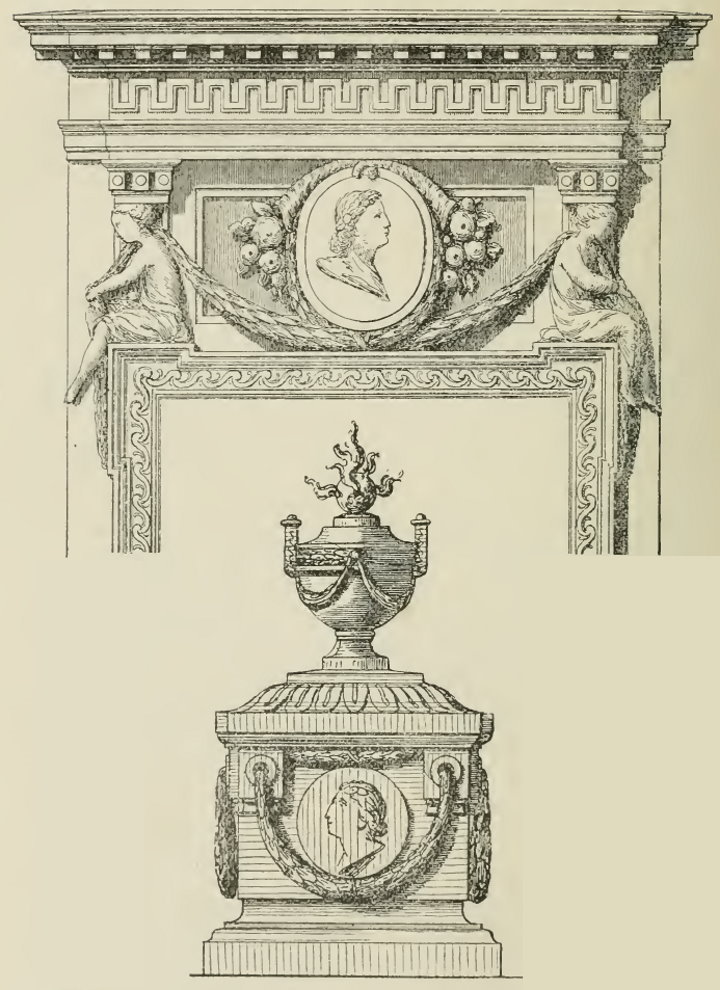
Louis XVI ornament was a brief return to the luxurious, and yet at the same time simple, motifs of the Italian High Renaissance (early 16th century). Empire-style ornament was a return to the Roman ornament from the Imperial era. Naturally, neither style contained anything original to distinguish them from their sources. Both styles included a large number of motifs and, due to their related sources, had many motifs in common. Louis XVI and Empire styles can be discerned based on their several favorite motifs, but exact determination of both styles is possible only based on their general tendencies.
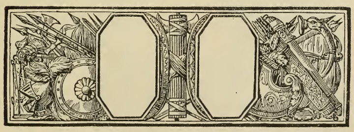
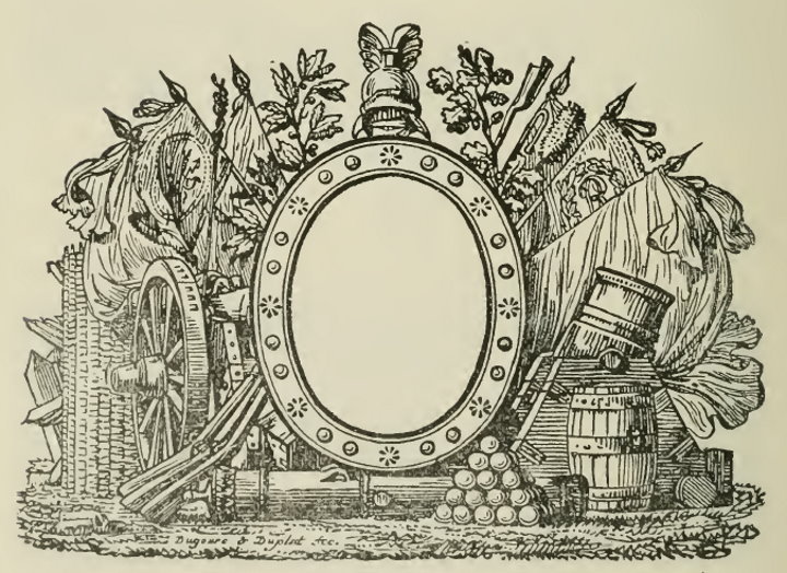
In the selection and combination of motifs, different goals can be found in these two styles: Louis XVI was an ornamentation of private life, while the Empire style was concerned with official ornamentation. Louis XVI style was about the calm and beautiful luxury of the old aristocracy, while the Empire style was about a cold remembrance of the new empire and its new social class. Louis XVI ornament was based on real-life, and devoid of any symbolism: in both life and on the page, it depicted the luxurious private ambiance, and feasted upon this ambiance: grooved columns and pilasters with sumptuous capitals of Corinthian holly, antique meanders along architectural lines, light balustrades on cornices and between windows; caryatids; statues and vases located along the cornices, in niches, on partitions, or at the foot of columns; branches and garlands of laurel and rose; cornucopias and baskets filled with fruit and flowers. In book ornament, vases, garlands and flowers (especially roses) were a favorite motif of Louis XVI style. During the years of the French Revolution, ornament became symbolic: it drew from Roman ornament its political and military emblems. The Empire style flows directly from this Revolution style: republican symbols replaced the imperial ones (for example, the Phrygian cap replaces the eagle), and military symbols remain, taking on a primarily victorious character; there arises an entire system of symbols for national, social, church, commercial, industrial, scientific and artistic activities and natural phenomena. State and military symbols were prevalent, however. Empire-style architecture, simple and cold, reproduced the basic forms of ancient temples with their Doric columns. The Empire style was characterized by its monotonous, almost miserly use of the inexhaustible decorative motifs from the early Roman empire and sometimes from the Greeks. Strips of holly, palmettoes, modest branches and garlands of oak or laurel leaves, images of ancient armor and weapons, medallions with pictorial scenes borrowed from ancient bas-relief and vases, griffons, sphynxes — these were the favored motifs of the Empire style. Frames for Empire style were always simple and strongly architectural. The motifs were not placed freeform, but according to a strong, simple symmetry.
All of these French styles were rare in folk manuscripts, because they required a high level of artistic skill. But, they could all be found in the albums, collections of verses, and other manuscripts which were used by the cultured class. As for the Russian architecture and everyday life of the upper classes, here familiarity with the French styles had special importance. Louis XVI style was widely used in these circles during Catherine II’s reign, and the Empire style was popular during Alexander I’s reign. It is worth remembering that in both cases, we have only starting or origination dates. For example, Rococo appeared in Russia in the mid-18th century, but was in use for as long as a century, continuing to live alongside styles which appeared later, and sometimes mixed with them in complex combinations. Likewise, the Empire style continued to be used in Russia during the reign of Nicholas I. Of course, these later variants of the Rococo and Empire styles have their own particular features.
Illustration 24: Augsburg engraving, mid-18th century. Illustration 25: From the book Georg Rumphs, Amboinische Raritaetenkammer. Vienna, 1766. Illustration 26: From a Liturgarion, Moscow, 1767. From a printed ecclesiastical book. Soch. Dm. Rostovskogo, vol. 4. Moscow, 1786. Illustration 28: Louis XVI Style. From the book: Neufforge, Recueil élémentaire d’architecture. Vol 5. 1763.
a. Door trim design. b. Design for a flame.Illustration 29: Empire Style. Illustration 30: Empire Style. From a book by the typographer Gillé, Épreuves des vignettes et fleurons. Paris, 1808. Illustration 31: Empire Style. From a book by the typographer Gillé, Épreuves des vignettes et fleurons. Paris, 1808. Illustration 32: Empire Style. From a book by the typographer Gillé, Épreuves des vignettes et fleurons. Paris, 1808.
Footnotes
| ↟1 | If the frame is implicit, then the ornament’s borders fall more or less along the natural borders of the surface which it covers. Such, for example, are ornaments which cover the margins of a manuscript or tattoos which cover the entire surface of a body. Sometimes, ornament will quite freely follow the natural borders of a surface, in which case they might have their own patterned or complex, implicit borders. In this case, one can speak of the shell (Rus. каркас, karkas) of the ornament. This shell is a solid frame, for example, feudal concrete statues or other buildings. |
|---|---|
| ↟2 | jeb: Interestingly, this word is used modernly to mean “splash screen”! |
| ↟3 | These are called a frontispice, to use the medieval French terminology. |
| ↟4 | A cul de lampe, to use the medieval French terminology. In modern typographic art, such ornament is called a kontsovka (Rus. концковка, from конец/konets, “end”), recently borrowed from the Polish (koncowka). Medieval Slavic calligraphy used the word ruka (Rus. рука, “hand”) to indicate a common type of kontsovka: the written text on the last page tapers toward the bottom, where it is enclosed by a forked branch held by a clasped hand. |
| ↟5 | In later Old Believer calligraphy, these marginalia are called a “flower” (Rus. цветок, tsvetok), as in 18th and 19th century manuscripts they were vegetative in character. |
| ↟6 | cf. Greek téras, “beast;” the term “teratological style” was introduced in Buslaev’s Sochinenija po arkheologii i istorii iskusstva (“Essays on Archeology and Art History”). |
| ↟7 | jeb: teratology: mythology relating to fantastic creatures and monsters. |
| ↟8 | Individual teratological motifs (that is, individual occurrences of these inseparable combinations of motifs of living beings, plants, and knotwork) are found in Rus’ as early as the 12th century. But, these rare occurrences did not yet represent an overall style of ornament, that is, a general principle. |
| ↟9 | The Rumjantsevskaya Psalter from the 1270s is similar in the drawings and coloration of its ornament to the 13th century Psalterium Bononiense; but at the same time, this 1270s Psalter contains the first accurately dated examples of the following phenomena in Russian teratology: 1) the motif of a bird with a human head in profile; 2) capitals where the shape of the background but not of the drawing atop it match the intended letter; 3) light blue paint used on capitals. |
| ↟10 | This motif clearly appears in the Regency style and (especially) in the Louis XV style. The basis of this motif grew under the hand of such artisans as the jeweler and decorator Juste Aurelle Meissonier (died, 1750), whom his contemporaries considered to be the inventor of the Rococo style. The established Rococo style, in a less artistic but more typical form, was especially widespread in Germany. |