Chapter 5 of Schepkin’s Textbook of Russian Paleography was actually what first drew me to this book, as it is one of only a handful of published scholarly overviews of vyaz’, or Slavonic ligatures, that I was able to find online when I started researching the topic. Vyaz’ has long interested me as an artistic technique, filling blocks of space in Russian manuscripts with letters written in striking bright red cinnabar ink. Especially with their interwoven forms and heavy use of abbreviation, they can be like a sort of puzzle to try to solve. Over time the vyaz’ techniques became so intricate and compact that the text became quite difficult to read, as all the letters and even the ligatures of different letters start to intentionally look the same. The scale also changed, creating longer, taller vyaz’ which allowed inserting more text into the line. This chapter is a nice overview of the history of this technique, from its Byzantine origins, its adoption into Cyrillic, and its development in Russia starting in the 15th century.
A Textbook of Russian Paleography
Chapter 5: Вязь (Vyaz’)
A translation of Щепкин, В.Н. «Вязь.» Учебник русской палеографии. Москва, 1918. с. 30-41. / Schepkin, V.N. “Vyaz’.” Uchebnik russkoj paleografii. Moscow, 1918. pp. 30-41.
[Translation by John Beebe, known in the Society for Creative Anachronism as Master Ivan Matfeevich Rezansky, OL.]
[Translator’s notes: I’ve done my best to convey both the meaning and style from the original. Comments in square brackets and footnotes labeled “jeb” are my own. This document may contain specialized vocabulary related to embroidery, archeology, Eastern Orthodoxy, or Russian history; see this vocabulary list for assistance with some of these terms. This translation was done for my own personal education, and is provided here as a free resource for members of the Society for Creative Anachronism who may be interested in this topic but are unable to read Russian. I receive no compensation or income for this work. If you like this translation, please take a look at other translations I have made available on my blog.]
[The article in the original Russian can be found here:
https://ru.m.wikipedia.org/wiki/Файл:Щепкин В.Н. Учебник русской палеографии. (1918) — цветной.pdf.]
Medieval Glagolitic and Cyrillic letters are shown in BukyVede font, cf. https://kodeks.uni-bamberg.de/AKSL/Schrift/BukyVede.htm
A Textbook of Russian Paleography
Chapter 1: Goals and Methods
Chapter 2: Old Slavonic Language and the Slavonic Alphabets
Chapter 3: Dialects
Chapter 4: Materials and Writing Tools
Chapter 5: Вязь (Vyaz’) (this post)
Chapter 6: Ornamentation
Chapter 7: Miniatures
Chapter 8: Watermarks
Chapter 9: Cyrillic Hands
Chapter 10: Russian Hands in Parchment Manuscripts
Chapter 11: South-Slavic Writing
Chapter 12: South-Slavic Influence on Russia
Chapter 13: Russian Poluustav Script
Chapter 14: Skoropis’
Chapter 15: Steganography (Tajnopis’)
Chapter 16: Numbers and Dates
Chapter 17: Verification of Dates
Chapter 18: Descriptions of Manuscripts
Appendix: Slavonic and Russian Chronology
Chapter 5: Вязь (Vyaz’)
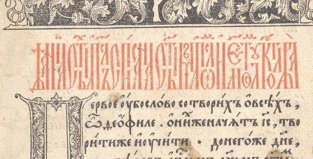
Вязь (Rus. vjaz’, “ligature”) is a form of Cyrillic decorative writing with the goal of joining a line of text into an unbroken and uniform type of decoration. This goal is achieved using various forms of abbreviations and decoration. Vyaz’ appears in manuscripts, frescoes, icons, on bells, on metallic and embroidered ecclesiastic items, and on tombstones. The content of these decorative lines consists of prayers, sayings, memorial inscriptions, and the names of medieval works of art; this latter case is the most common in manuscripts. Where we do not find vyaz’, a location for it may have been laid out for decorative purposes, with the inscription’s dimensions determined by the content. The goal, therefore, always was to beautifully position the predetermined number of letters into the defined space. If the number of letters was large but the space was small, the scribe would resort to abbreviations; in the opposite situation, he would fill the empty space with various kinds of decoration. Decorations were also used in cases where letters, based on their appearance, left unattractive spaces at the top, bottom, or center of the line. But there are lines of vyaz’ which, which containing no substantial use of abbreviations or decoration, nevertheless convey the impression of continuous ornamentation and, as such, are still understood to be vyaz’. The various techniques of vyaz’, including abbreviations and decorations, arose at different times in various locations, and as such they contain paleographic data. Depending on the material and the purpose of the items decorated with it, vyaz’ can be divided into categories which the paleographer should study separately, because given the similarity of the general development of these methods, identical changes in different kinds of vyaz’ may not have occurred at the same time. For example, the use of vyaz’ on metallic vessels outstripped the use of vyaz’ in manuscripts in development, while its use in printed material lagged behind it. Here, we shall examine the use of manuscript vyaz’ exclusively.
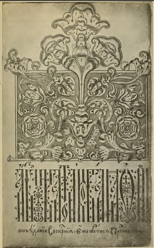
The header reads:
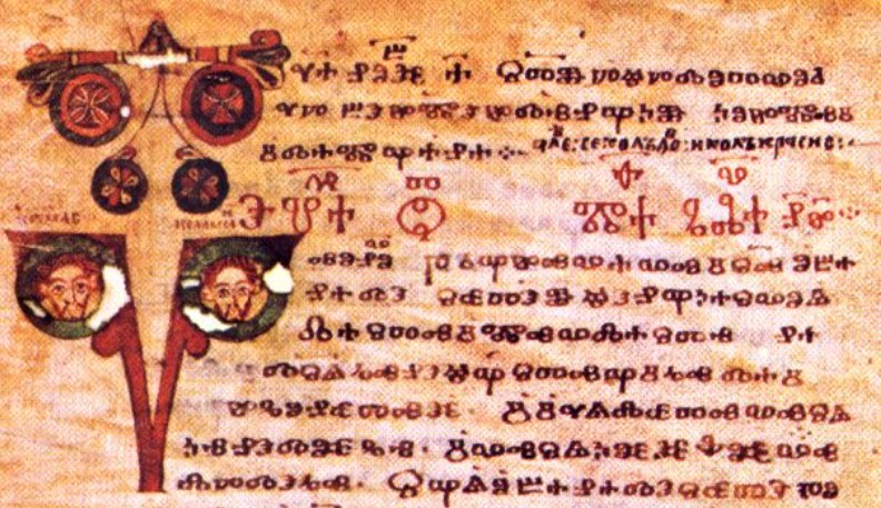
ⰵⰲⰰⰼ҃ ⱉⱅ҃ ⰿⰰⱚ҃ ⰳⰰⰲ҃ ⱀ҃ⰸ҃⁘ (еваꙅ҃ от҃ маѳ҃ глав҃ н҃з҃⁘ / evandz[elie] ot[ŭ] ma[t]f[eja] glav[a] 79 ⁘ / Gospel of Matthew, Chapter 79[1]jeb: I’m not sure I’m reading this number correctly. The two characters shown are N (70) and Z (9), each with a titlo overhead to indicate they’re being used as numerals. This is the start of the reading for Sts. Kosmas and Damian (Mat. 10:1-8), whose names and faces are seen in the illuminated capital..)
Image in public domain.
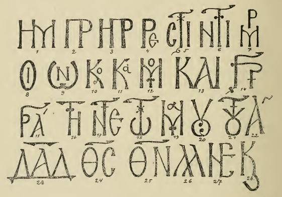
The vyaz’ system developed in Byzantium after the development of Slavic writing, and as a result, vyaz’ is not present in hits earliest period. Among the South Slavs, the first accurately dated works of vyaz’ date to the first half of the 13th century, and among the Russians, to the late 14th. In Byzantium, up until the 10th century, the initial lines of a manuscript were little different from the rest of the text. They were sometimes written in a different hand (Rus. почерк, pocherk), such as in ustav (Rus. устав, “charter”, the earliest Cyrillic hand) in a work written in cursive (Rus. скоропись, skoropis’, literally “quick writing”); sometimes they were written in larger letters, or they were written in crimson ink. Often they were little different from the rest of the text, but over the letters from left to right, a layer of transparent yellow or green paint would be applied with a brush. Among the Slavs, the earliest Glagolitic manuscripts were most similar to the Greek works of their time. In these earliest Glagolitic manuscripts, we find the headings in crimson (the Codex Marianus) and covered (Rus. помазанный, pomazannyj, “annointed”) with transparent color (the Codex Assemanius). Glagolitic headers were also written in a more separated and angular form, or one could say “in a more formal hand,” typically in significantly larger letters. In the Codexes Assemanius and Marianus, smaller title lines were often written in lowercase and differed from the test of the text only by color. In Byzantium, starting in the 10th century but still somewhat infrequently, the headings especially in liturgical charters became larger and more calligraphic. The letters began to be double-outlined. These outlines were sometimes shaded in or completely painted in, sometimes in two or three alternating colors. At the end of the 10th century, decorations appear on individual letters and ligatures (Rus. лигатура, ligatura) of two adjacent letters. These were also found in Russia up to the end of the 14th century, but these cases were not systemic in either country. Starting in the 11th century, Byzantine manuscripts with similar headings are encountered more frequently, and their ligatures become more complex and more common. These elements resulted by the mid-11th century in the formation of Byzantine vyaz’, that is, systematic decorative writing. The 12th century was the time of the greatest use of Byzantine vyaz’. In the 13th and particularly in the 14th centuries, its use shrank markedly, and in the 15th century it disappeared almost completely. Byzantine vyaz’, once formed, remained almost unchanged and even during the time of its greatest development, it was used relatively less than in Russia in the 15th-17th centuries. Byzantine vyaz’s scale (Rus. показатель, pokazatel’, “indicator”) has always been between 2 and 3.[2]The scale (Rus. показатель, pokazatel’) is a term for the relationship between the height and width of so-called double-riser (Rus. двухмачтовый, dvukhmachtovyj, “double-masted”) letters, such as и, н, п. As such, for square letters, the scale would be equal to 1. Decorations in Byzantine vyaz’ were typically small plant motifs: twigs, stalks, tendrils, proboscises, and knots (see Illustration 3). Abbreviations consisted of ligatures, usually with adjoining risers (illus 3, 1-3), the subordination of some letters to others (illus 3, 5-6), the subordination of multiple letters (illus 3, 7), the inclusion of one letter inside another (illus 3, 8-12), and letters which touch at a single point rather than along an entire line (illus 3, 13-14), as well as various combinations of these features (illus 3, 15-21). Moreover, specific words (major religious concepts) were written as abbreviations under a horizontal titlo: ︮с︯ = еос (Gr. theos, “God”), ︮н︯ = еон (Gr. theon, “of God”), д︮а̅д︯ = даѵід (Gr. David) – see Illustration 3, 23-25.
While, in the sphere of vyaz’, the Byzantines achieved only initial results, and while their vyaz’ is not at the same level as their other artistic and technical creativity, this was rooted entirely in the nature of the Greek alphabet and language. In a technological and artistic sense, the most basic method of vyaz’ is the riser ligature, that is, the joining of two adjacent vertical lines into one. In this way, the Cyrillic alphabet is just incredibly richer than the Greek alphabet. Cyrillic has 36 letters, out of which 26 have risers. Based on simple algebra, the overall number of possible two-letter combinations in Cyrillic is around 650. In practice, many of these combinations are not possible, for example, л+к allows for a riser ligature, but к+л does not. On the other hand, many possible ligatures were unusable because of their ambiguity. For example, ![]() could potentially indicate ть, бъ, or гъ;
could potentially indicate ть, бъ, or гъ; ![]() could mean бг, гб, бб, or ггь; and
could mean бг, гб, бб, or ггь; and ![]() could mean бв, вб, гв, вг, бб, бь, бр, грь, or брь; and so forth. Such indecipherable ligatures are almost never encountered. Some combinations which are completely possible to write are not present in the language. Even with all these limitations, however, Cyrillic has in practice no fewer than 450 double-letter riser ligatures. This large number can be explained in that Cyrillic vyaz’ developed after the disappearance of the weak semi-vowels ъ and ь, that is, in that time of Slavic languages when the largest number of combinations of adjacent consonants was possible.
could mean бв, вб, гв, вг, бб, бь, бр, грь, or брь; and so forth. Such indecipherable ligatures are almost never encountered. Some combinations which are completely possible to write are not present in the language. Even with all these limitations, however, Cyrillic has in practice no fewer than 450 double-letter riser ligatures. This large number can be explained in that Cyrillic vyaz’ developed after the disappearance of the weak semi-vowels ъ and ь, that is, in that time of Slavic languages when the largest number of combinations of adjacent consonants was possible.
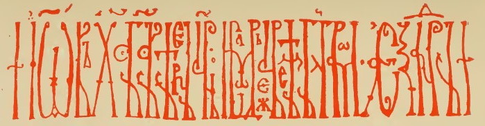
стихірал҇[ь] мѣсѧчныи съ б︮г︯ом по\чинаемъ, бл[аго]с҇[ло]ви ꙍ꙽ч︮е︯ (Mod. Rus. стихираль месячный о боге начинаем, благослови отче, “We begin the monthly verse about God, Bless the Father”)
The marks over the lines in black are a form of musical notation for singing the verse.
Photo shared under Creative Commons Attribution Share-Alike 4.0 International license.
Compared to Cyrillic, the Byzantine’s were astonishingly limited in what they had to work with. They did not have the masted-letters ч, ш, щ, б, ъ, ь, ю, ꙗ, etc. The entire Greek alphabet is made of up 24 letters, among which there are only 12 letters with risers. According to the same formula, the maximum number of all combinations comes to only around 132. In practice, there were a number of limitations. The ligatures нв and ир are possible, but ви and рн are not. Many of the combinations don’t occur in the language, for example, нв was replaced by мв, and нп turned into мп in order to provide a masted ligature, but this doesn’t compensate for the low number of possibilities. Furthermore, мр turned into мвр, and ир became идр, which again did not compensate for the low number of combinations.[3]Writing ив, ин, or ир was possible only when the letter и fell at the end of a word and the в, н, or р was the first letter of the following word. But, these words merged only in cases of very close vyaz’. As a result, the Byzantines had in practice scarcely more than 40 two-letter masted ligatures, of which some were constantly repeated. Based on this limited material, it was not possible to build a wieldy system of artistic vyaz’. But the Byzantines invented the principle which would find happy development on different soil.
Among the South Slavs, vyaz’ was known starting in the 13th century. Its earliest dated work is a victorious inscription from the 1230s by Tsar Ivan Asen II of Bulgaria, on a marble column in the Sts. Holy Forty Martyrs Church in Tyrpov. This inscription, as well as 13th century Serbian vyaz’ (for example, in the Synodal Library Hexameron (Rus. Шестоднев, shestodnev, “six days”) from 1263) can hardly be called artistic. In the 14th century, South Slavic vyaz’ became richer and more interesting than its Byzantine models. South Slavic calligraphers obviously mastered the system of vyaz’ and developed it on the more rewarding Cyrillic basis. It was first used in charters, in the names and titles of the Bulgarian tsars and Serbian monarchs; later, it was used in all South Slavic manuscripts. Mt. Athos appears to have been the center from whence artistic vyaz’ became widely used in Slavonic manuscripts starting in the mid 14th century. Two styles are outlined in this South Slavic vyaz’. The first draws its motifs from the world of plants and partly from the world of insects (which is noticeable not only in small decorations but also in its interpretation of the convoluted and rounded contours of the letters themselves); the second style, which was significantly rarer, avoids decoration and is content with strict reproduction of the geometric elements of Cyrillic. More beautiful than either of these styles is the South Slavic middle style, which combines the free geometric character of the letters with light plant-based decorations. The fall of the South Slavic kingdoms in the 14th century halted the development of South Slavic vyaz’, which continued to survive in the 15th and 16th centuries, giving rise to interesting manners of natural styles, but which no longer invented any new technological methods. In the 15th century, Romanian vyaz’ appears. It was based on South Slavic vyaz’, and represents various manners of the natural style. Particularly widespread was a manner of tall letters with reduced risers and tails, quite rarely standing in a single line.
In Russia, vyaz’ appears in the late 14th century along with other signs of the South Slavic influence, which is covered in detail below. Before this time, in the 13th and 14th centuries, we find only a large collection of ligatures in the heading lines, but there is no system of decorative writing. Even in the late 14th century, that is, in the early days of the South Slavic influence, vyaz’ is found in Russian manuscripts extremely rarely. The earliest dated example of Russian vyaz’, a Stikhirarion from 1380 written and stored in the Trinity-Sergius Lavra, contains lines of very complex vyaz’, immoderately combining techniques of skoropis’ and other abbreviations, and with spaces filled with small letters. In these lines, we see a paleographic happenstance: they do not represent the main trends of vyaz’, but rather only intricate experimentation. In Russia, the 15th century was the time of vyaz’s adoption. In the Great Russian regions, the old cities of the North-West (Novgorod, Pskov, Tver’) and in the center (the Trinity-Sergius Lavra, outside Moscow) became the breeding grounds for this art. We can determine from manuscripts dated to the 15th century how vyaz’ arose in Russia and how it spread through the Russian lands. The two styles already seen among the Southern Slavs, the “natural” and “geometric” styles, crossed over into Russia. The “middle South Slavic style” which tactfully united these two motifs, also seems to have prevailed in 15th century Russia.
Among the works of this “middle style”, we can list: 1) a South Slavic Gospel, bought in 1430 on Mt. Athos and bought to Tver’ in 1434; 2) two autographs by the well-known Serbian and 15th-century Russian author Pachomius Logothetes (manuscripts from 1443 and 1459); 3) a 1481 Russian copy of an autograph by another important ambassador of the South Slavic influence on Russia, Metropolitan Cyprian of Kiev – this is a missal (Rus. требник, trebnik), in the afterword of which the Russian copyist begs future copyists not to add or remove any text, or even the smallest marks of the new (South Slavic) orthography and graphics; 4) a Russian parchment Gospel of undetermined year, or an autograph, possibly belonging to one of St. Sergius’s students, the Rev. Nikon of Radonezh (died, 1427). We should also mention here several rarer forms of vyaz’ which came to Russia through the South Slavic influence. These lines, containing various decorative motifs, were borrowed from late Greek cursive, as well as lines of Byzantine monocondyla, artistic monograms which imitated Arabian writing.
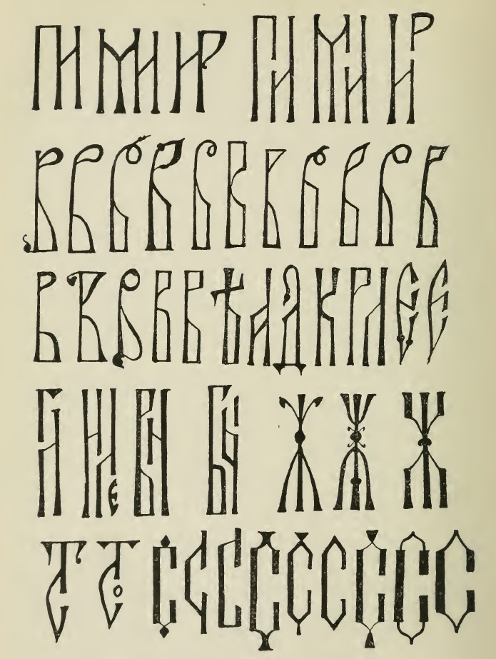
By the late 15th century, vyaz’, as a beloved calligraphic device, was widely spread throughout the entire lands of the Russian peoples, and from this moment we begin to see differentiations in the forms of Russian vyaz’. The Russian territory was at that time divided into two societal unions: Lithuanian-Russian, and Muscovite. In the area of vyaz’, Western and Southern Rus’ favored the natural principle, endlessly reproducing its South Slavic and Romanian examples with various levels of merit. In Muscovite Rus, the geometric form was prevalent. While Western and Southern Rus’ never added to the technical system of vyaz’ which had been created by the Southern Slavs, Muscovite Rus’ invented various, previously unseen technical skills which generated in vyaz’ interesting artistic development and precious paleographic data. Around the year 1500 (the earliest example is from 1499), Pskovian manuscripts discovered the method of compressing the old masted ligatures: a common riser for two adjacent letters was combined in the center (see illustration 4, row 1, the ligatures ни, ми, ир). Above all, this method opened the floodgate to the use of vyaz’, which earlier had been limited in its definition. Now, masted ligatures, without losing their compactness, acquired a separation which allowed the eye to easily proceed from the line of combination by following the mast up and down. This form of combination was little used outside of Pskovian manuscripts through the late 16th century. Sixteenth-century Novgorodian vyaz’ was known for its graceful geometric style, but showed little new technological growth. In relation to paleography, an important ligature is ст, which arose in Russian copies in Novgorod around 1550 (the earliest example in a manuscript is from 1552 – see illustration 4, row 5). This ligature was little seen outside of Novgorodian manuscripts until the late 16th century. In the second half of the 16th century, the Muscovite Calligrahic School in Grozny, having mastered Novgorodian vyaz’ after Macarius’s move to the Metropolitan department, increased the number of half-masted letters (Rus. полуштамб, polushtamb, “half-stem”): letters equipped with loops (б, в, р, ъ, ы, ь, ѣ) as well as oblique lines (а, д, ж, к, л, м, ч). South Slavic vyaz’ had already been able to depict these letters either in the form of arcs or as straight lines with a short rounding on one side. Novgorodian vyaz’ had replaced these turn with angled lines, that is, sometimes gave these loops and oblique lines exclusively straight-lined forms. For example, see illustration 4, row 2: the small straight lines which replaced the curved and diagonal lines could also be called half-masted letters. But, in Novgorod and in the Muscovite Macarius school (1550s), not all letters were exposed to this kind of change. It was used most often on the letters б, в, ѣ, less often on ъ, ы, ь, and even less frequently on ж, м. In the Grozny school, starting in the 1560s, this method also expanded to the letters а, д, к, л, р, and the tongue on the letter е (see illustration 4, row 3). This change was not obligatory and therefore did not yet detract from calligraphic diversity. The number of vertical half-masted letters nevertheless expanded greatly under the Grozny school, and this brought to life two new technological methods. First, these new half-masted letters could be positioned in a single vertical row, either with one another, or combined with one of the old masted letters. This achieved a sort of “pseudo-compression,” that is, combinations which had not existed earlier in masted ligatures (see illustration 4, row 4, symbols 1-3: гл, иле, вн). This technique (almost unknown prior to the Grozny school) would become widely used. Secondly, the letters which received these half-masts were able to either rise above or fall along these half-masts, allowing them to be located either above or below the line of the neighboring letters (see illustration 4, row 4, symbol 4, бы). This technique was also not seen in manuscripts prior to the Grozny school. Starting in the late 16th century, it spread throughout the lands of the Muscovite empire, but prior to the Pomorian School of the 18th-19th centuries, it was applied sparingly in manuscripts.
The Grozny calligraphic style outlived the Time of Troubles, and still appears in manuscripts from the first quarter of the 17th century, but primarily in ones written at the Trinity-Sergius Lavra. This also applies to its vyaz’. But, during the rule of Tsar’ Feodor I Ivanovich (ruled 1584-1598), the Grozny style was disrupted in all areas of art by an invasion of various new elements. The vyaz’ from manuscripts from Tsar Feodor I’s reign is marked by a generalization of all of the Great Russian developments from the 16th century. In one line from 1587 (a manuscript created by Maksim Grek), we find together half-masts, real and pseudo-compression, as well as the ст ligature. In the same line, the letter с contains the first instance of the appearance of zero-stems (Rus. нольный штамб, nol’nyj shtamb, “null stem”), which are formed from the large rounded shapes of letters such as е, о, с, ꙋ, ф, х, ю, , and ꙍ — all of which in the Grozny school retained their curves. The angular с in the 1587 manuscript is an uncommon, early instance of this phenomenon, which only later would acquire chronological dating significance, gradually becoming applied to all of the letters listed above, forming a new style which would spread to all of the Russian lands (see illustration 4, row 5, symbol 3: с from 1587, and symbols 4 and later, angular letters с from the 17th-18th centuries). On Russian metallic vessels, we find this angular style (Rus. штамбованый стиль, shambovanyj stil’, “stamped style”) as early as the middle of Tsar’ Michael I Feodorovich’s reign (1613-1645). In manuscripts, it arose more gradually, in religious and literary manuscripts with the letters ꙋ and х, and then in the majority of the remaining letters, we see the appearance of these zero-stems over the course of the 1640s. If in Pskovian manuscripts from the first quarter of the 17th century we find complex angular vyaz’, this is because they are later title pages which were added later, as can be identified by the differences in the paper. Only from the mid-17th century is it possible to speak of a complex angular or fraktur style (Rus. фрактурный стиль). The vertical masts and angles decisively prevailed over the previous twists, and this disappearance of rounded forms resulted in the appearance of new openings in the line. Plant designs of branches and vines were added as a necessary decorative technique, hiding these gaps.
Toward the end of the 17th century, all possible natural conclusions were taken from these new techniques; all the best combinations which did not reduce clarity were discovered. From this moment, the artistic decline of vyaz’ began, which nevertheless continued to live on in Old Believer circles over the course of the 18th and 19th centuries.
From the appearance of vyaz’ in Russia up through the very end of the 17th century, the scale (proportion of height to width) of vyaz’ grew rapidly. In the 15th century, scales of 3 and 4 were prevalent. In the 16th century, the scale ranged from 4 to 8. Excellent lines of Novgorodian vyaz’ had scales of 4.5 to 4.75, Pskovian works had scales of 5-7. Western-Russian lines sometimes reached a scale of 8. Over the course of the 17th century, the scale rose from 7 to 12. Vyaz’ from the end of the 17th century, with scales ranging from 10-12, became their own form of steganography (Rus. тайнопись, tajnopis’). We note that, in practice, each century often uses even narrower scales than that of the previous century. As a result, and in this case, given the lack of new developmental features, vyaz’ cannot provide paleographic data.
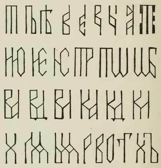
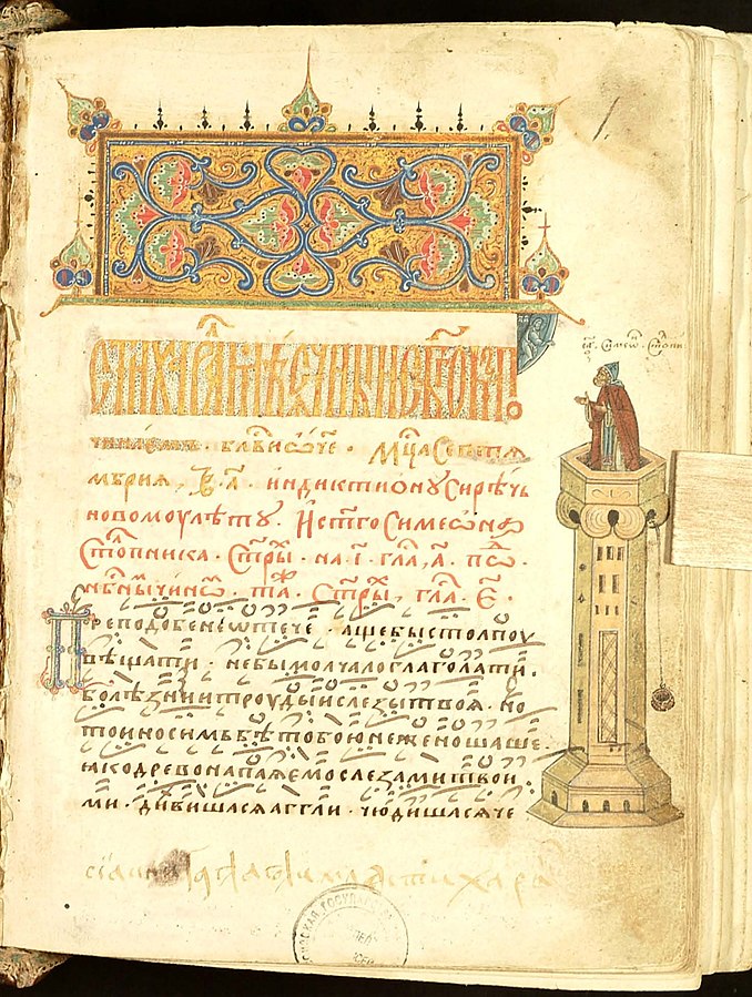
In the 18th century, vyaz’ was preserved primarily in Old Believer writing. The best works of Old Believer art are conditionally called the Pomorian style.[5]The best works of Old Believer calligraphy from the 18th and 19th centuries are associated by the Old Believers themselves with the history of the Pomorian movement, that is, one of the Old Believer Russian churches, which got its name from the northern Pomor’e region of European Russia. In actuality, across all of Northern and North Eastern Russia, various Russian sects used the same calligraphy. As a result, it is possible to speak of Pomorian vyaz’. It is at least worth differentiating two periods of Pomorian vyaz’: the old (18th century) and new (19th century). The older form of Pomorian vyaz’ was based on late Muscovite vyaz’ (angular, second half of the 17th century); the new vyaz’ differed from the earlier form in its immoderate use of all of the techniques assimilated (or, to be more accurate, invented) by the older Pomorian vyaz’. Without a review of the chronology of each of these techniques, I will limit myself to the following examples (see Illustration 5):
- Half-masts become full-masts, see the letters т, ъ, ѣ on illustration 5, row 1, symbols 1-3 (these are South Slavic types from the 14th-15th centuries!);
- Suspended half-masts multiply, see illustration 5, row 1, symbols 4-7, the letters в, е, в, б (the earliest ы of this type was seen in the Grozny school!);
- Letters become decorated with “stumps” (Rus. обрубок, obrubok); see illustration 5, row 1, symbol 8 (the letter а);
- Pseudo-stumps (Rus. ложный обрубок, lozhnyj obrubok) appear; see illustration 5, row 1, symbol 9 (the letter т);
- Full-masts form numerous ligatures; see illustration 5, row 2, the ligatures ню, не, ис, тр, тѡ, ѡб;
- Half-masts form numerous ligatures with other half-masts; all of these combinations are similar to the letter м; see the ligatures ва, вд, вл, ка, кд, кл, illustration 5, row 3 (until the 18th century, only the beautiful and clear Novgorodian ligature ст was drawn using this principle);
- Pseudo-ligatures of the same sort appear; these all look similar to an angular х; see the ligatures ыѧ, лѧ, illustration 5, row 4, symbols 2-3;
- Letters take on an oblique slant, see illustration 5, row 4, symbols 4-6, the letters р, в, о;
- Symmetrical parts of letters become asymmetrically separated, see illustration 5, row 4, symbol 7, the letter т;
- Combinations of certain half-masted ligatures appear compressed, see illustration 5, row 4, symbol 8, the ligature хъ.
All of these features, which appeared gradually from the late 17th-early 18th centuries and multiplied during the 19th century, have meaning not only for the paleographer, but also for archeologists. Artisans of the 19th century used almost exclusively this older form of Pomorian vyaz’, as a result of which it appears everywhere on counterfeit or poorly renovated works of art and everyday life.
All of the technological innovations of vyaz’ which contain dates at the same time also represent a certain artistic value, just as do all experiences in vyaz’, because the use or lack of use of a particular technique is dependent on free selection. As such, in vyaz’, the absence of a given technique cannot show that a work was created before that technique’s invention, but the presence of a given technique can only give us an earliest date (terminus a quo).
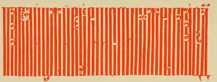
Plates
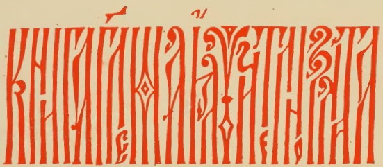
Plate 1
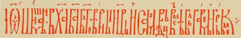
jeb: іѽ[анн]ши́шманъ·в х︮а︯ б︮а︯ б︮л︦г︯овѣ́риыи ц︮р︯ь и҆ самовдьц всъмѣ́ бльга́ромь н҆ грь́кьом ⁖
(Ivan Shishman, In Christ the Lord, Faithful Emperor and Autocrat of All the Bulgarians and Greeks)
jeb: въстѹню велкѹю н︮е︦д︯п︮а︯хыиалїтр·еугелїе (I begin (??) the great […] · The Gospel)
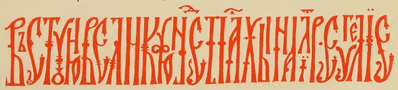
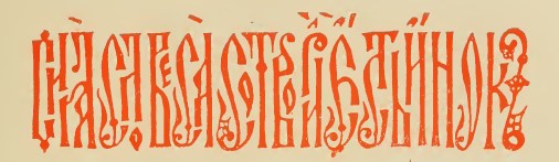
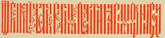
Plate 2
jeb: ѳалеѡлогавингабытенскаꙗвоеженском
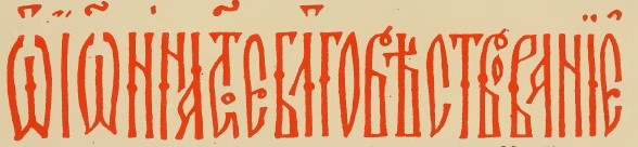
jeb: ѽїѽ[аг]и҆и а[по]с︮т︦о︯[льно]е бл҃говѣстворанїе҆ (The Holy Apostolic Gospel)
jeb: книга глаг︮[о]л︯емаꙗ῍ учително зл[а]т[оустн]ая (Chrysostom’s Instructive Word Book – the saint’s name in Russian is Иоанн Златоуст / Ioann Zlatoust / John “the Golden Tongued”)
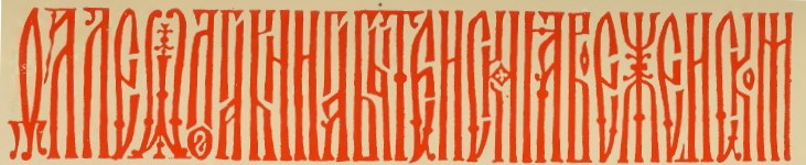
Plate 3
jeb: сиꙗ҅ словеса҅ сотвори῎[л] е῎сть и῎нок [макснм] (The monk [Maksim] created these words.”)
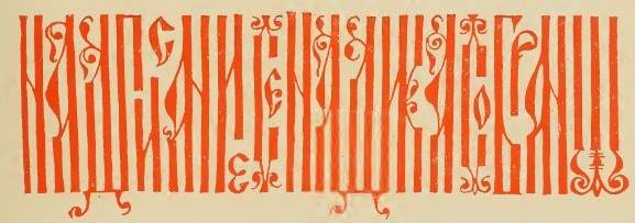
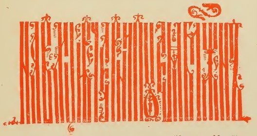
Plate 4
Footnotes
| ↟1 | jeb: I’m not sure I’m reading this number correctly. The two characters shown are N (70) and Z (9), each with a titlo overhead to indicate they’re being used as numerals. This is the start of the reading for Sts. Kosmas and Damian (Mat. 10:1-8), whose names and faces are seen in the illuminated capital. |
|---|---|
| ↟2 | The scale (Rus. показатель, pokazatel’) is a term for the relationship between the height and width of so-called double-riser (Rus. двухмачтовый, dvukhmachtovyj, “double-masted”) letters, such as и, н, п. As such, for square letters, the scale would be equal to 1. |
| ↟3 | Writing ив, ин, or ир was possible only when the letter и fell at the end of a word and the в, н, or р was the first letter of the following word. But, these words merged only in cases of very close vyaz’. |
| ↟4 | jeb: The order of illustrations 5 and 6 is shown here as in the original text. |
| ↟5 | The best works of Old Believer calligraphy from the 18th and 19th centuries are associated by the Old Believers themselves with the history of the Pomorian movement, that is, one of the Old Believer Russian churches, which got its name from the northern Pomor’e region of European Russia. In actuality, across all of Northern and North Eastern Russia, various Russian sects used the same calligraphy. |