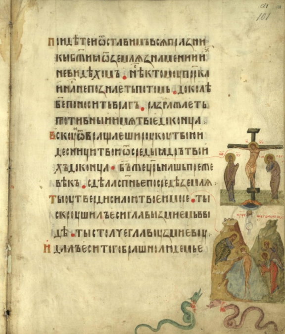
Schepkin’s 10th chapter is titled “Russian Writing on Parchment.” He focuses on Russian writing in the 11th-14th centuries, the period when Russian ustav or “charter” hand was predominant. He traces the evolution of several letters across the centuries, which makes sense that one of his main goals was the ability to determine when a manuscript originated, based on its letter styles. He provides a few images showing the evolutions of these letters over time, but no examples of entire pages of calligraphy to see the hands in context. I’ve added some photographs of various Russian manuscripts to help demonstrate how writing styles evolved through the Kievan Rus’ period, the Tatar Invasion, and the subsequent division of the Russian lands into Eastern and Western Russia (Lithuania and Moscow). The chapter ends around the turn of the 14th-15th centuries, when the kingdoms of Serbia and Bulgaria fell to the Turks, and large numbers of churchmen (including scribes and illuminators) migrated from the Balkans to Russia, initiating what the author calls “the South Slavic Influence” which would dramatically change Russian writing.
A Textbook of Russian Paleography
Chapter 10: Russian Writing on Parchment
A translation of Щепкин, В.Н. «Русская письменность на пергаменте.» Учебник русской палеографии. Москва, 1918. с. 97-108. / Schepkin, V.N. “Russkaja pis’mennost’ na pergamente.” Uchebnik russkoj paleografii. Moscow, 1918. pp. 97-108.
[Translation by John Beebe, known in the Society for Creative Anachronism as Boyarin Ivan Matfeevich Rezansky, OL.]
[Translator’s notes: I’ve done my best to convey both the meaning and style from the original. Comments in square brackets and footnotes labeled “jeb” are my own. This document may contain specialized vocabulary related to embroidery, archeology, Eastern Orthodoxy, or Russian history; see this vocabulary list for assistance with some of these terms. This translation was done for my own personal education, and is provided here as a free resource for members of the Society for Creative Anachronism who may be interested in this topic but are unable to read Russian. I receive no compensation or income for this work. If you like this translation, please take a look at other translations I have made available on my blog.]
[The article in the original Russian can be found here:
https://ru.m.wikipedia.org/wiki/Файл:Щепкин В.Н. Учебник русской палеографии. (1918) — цветной.pdf.]
Medieval Glagolitic and Cyrillic letters are shown in BukyVede font, cf. https://kodeks.uni-bamberg.de/AKSL/Schrift/BukyVede.htm
A Textbook of Russian Paleography
Chapter 1: Goals and Methods
Chapter 2: Old Slavonic Language and the Slavonic Alphabets
Chapter 3: Dialects
Chapter 4: Materials and Writing Tools
Chapter 5: Вязь (Vyaz’)
Chapter 6: Ornament
Chapter 7: Miniatures (this post)
Chapter 8: Watermarks
Chapter 9: Cyrillic Hands
Chapter 10: Russian Writing on Parchment
Chapter 11: South-Slavic Writing
Chapter 12: South-Slavic Influence on Russia
Chapter 13: Russian Poluustav Script
Chapter 14: Skoropis’
Chapter 15: Steganography (Tajnopis’)
Chapter 16: Numbers and Dates
Chapter 17: Verification of Dates
Chapter 18: Descriptions of Manuscripts
Appendix: Slavonic and Russian Chronology
Chapter 10: Russian Writing on Parchment
From the 11th to the early 15th centuries, that is, over the course of four centuries, Russian writing styles (Rus. графика, grafika, “graphics”) underwent uninterrupted evolution, in many ways different from that among the South Slavs. Russian hands within this time period should be viewed as independent from those used by the South Slavs. Only at the beginning and end points of this journey are comparisons to South Slavic writing styles necessary: in the 11th century in Russia an Old Bulgarian influence was already seen, and in the early 15th century, Middle Bulgarian and Serbian influence began to be felt.
The dated works from the 11th century mentioned above[1]jeb: These were listed in Chapter 9: the Ostomir Gospel of 1056-1057, the Svyatoslav Izborniks of 1073 and 1076, the Arkhangelsk Gospel of 1092, and three Novgorodian Menaia from the 1090s. all belong to the second half of the century. Aside from these, undated Russian manuscripts have also survived which are dated to the 11th century based on the similarity of their features to the aforementioned dated works. Based upon this similarity, we may conclude that the undated Russian manuscripts which originated in the 11th century also come from the second half of that century.[2]Mainly for practical purposes in this work, we will not provide lists of undated manuscripts, even from these earliest time periods.
Based on its hands, the Russian 11th century has much in common with the 12th century. Common to both centuries, the letter и (“i”) is quite similar to the printed letter н (“n”) (see illustration 39, row 8, letter 1). The letter н (“n”) is identical to that in the Latin alphabet (illustration 39, row 8, letter 6), and yet there are three variants of the letter н with a shortened crossbar (illustration 39, row 8, letters 7-9) — in the 12th century, the first of these symbols (letter 7) was most common; a symmetric letter ж (“zh”); and a symmetric letter ч (“ch”). with either rounded or angular bowls. In general, both centuries are united in their predominately geometric style of writing and, wherever possible, in the symmetry of the letters’ parts.
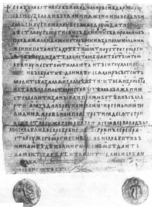
The differences between the 11th and 12th centuries are few and not very large. From the 11th century, for the most part, beautiful calligraphic manuscripts have survived, written in more or less large, graceful hands. Small and simple hands were known mainly at the very end of the 11th century. In the 12th century, manuscripts of a more simple and smaller “businesslike” hand predominated, corresponding to the separation of the Russian territory into principalities with local centers. There are very few sumptuous manuscripts from the 12th century.[3]There are 8 Russian works dated to the 12th century: 1. The (luxurious) Mstislav Gospel, written around 1115; 2. the Yuriev Gospel, written around 1120; 3. the Galician Gospel, written in 1144; 4. a holiday sticherarion written in 1157 (the above four are stored in the Patriarchal Library in Moscow); 5. a holiday sticherarion written around 1160 (Petrograd Theological Academy), 6. the Dobrilovo Gospel from 1164 (the Moscow Rumjaitskaja Academy); 7. the letter from Princes Mstislav and Vsevolod to Novgorod’s Yuriev Monastery, written around 1130; 8. a grant letter (Rus. вкладная грамота, vkladnaja gramota, “contribution certificate”) from the Reverend Varlaam to the Khutyn Monastery near Novgorod, written around 1192. There are significantly more undated works from the 12th century.

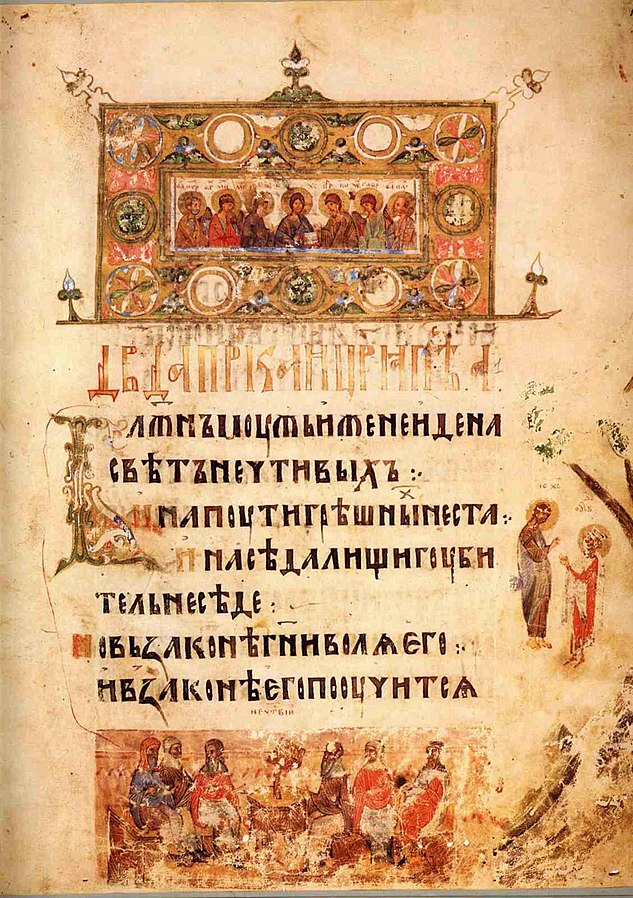
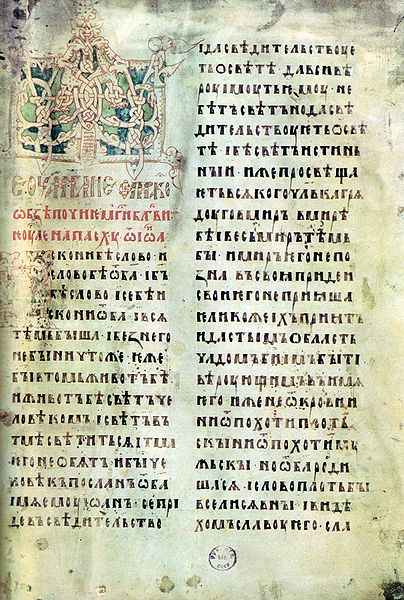
jeb: A page from the Svyatoslav Izbornik, 1073, written in ustav hand. Photo in public domain. jeb: A page from the Yuriev Gospel, c. 1120, written in ustav hand. Photo in public domain. jeb: The letter from Princes Mstislav and Vsevolod to Novgorod’s Yuriev Monastery, 1130, written in ustav hand. Photo in public domain.
The only letters which differed strongly between the 11th and 12th centuries were the letters jat’ (ѣ, ě), omega (ѡ, o), and psi (ѱ, ps).
In the 11th century, the “mast” on the letter ѣ did not extend above the tops of the other letters, and the cross-stroke lay below this level (illustration 39, row 10, letters 1, 4, 5). In the 12th century, the “mast” on this letter usually rose slightly above the tops of the other letters, with the cross-stroke sitting around that upper level (illustration 39, row 10, letter 6). One significant exception to this is the Izbornik from 1073, in which the letter ѣ is of 12th-century style. In addition, in the 11th century, they sometimes used (typically at the end of a row) a special, decorative ѣ with a very tall mast, sometimes with the crossbar near the very top (illustration 39, row 10, letters 2 and 3). The letters omega and psi were used relatively infrequently: 1) in words borrowed directly from Greek — іѡань (Ioaně, “John”), ѱалтирь (psaltirě, “psalter”), et.al.; 2) In a few Slavonic words — ѿ = отъ (otŭ, “from”), ѱи = пьси (pěsi, the nom. pl. “dogs”), ѱати = пьсати (pěsati, “to sing”), et.al.; 3) as numerals — ѡ҃ = 800, ѱ҃ = 700. In Gospels, Epistles, and other liturgical texts, these letters can be found at the beginning of a pericope (Rus. зачало, zachalo), or excerpt read in church.
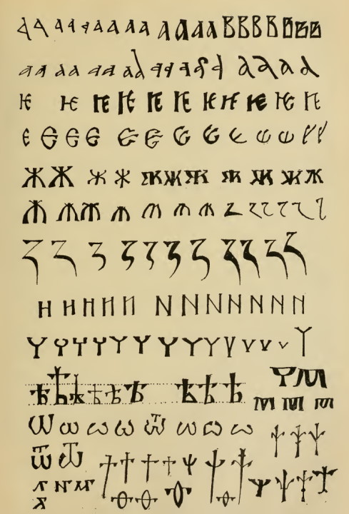
In the 11th century, the letter omega almost without exception had a tall center, like the following: ѡ (see illustration 39, row 11, letters 1, 2, 6; row 12, letters 1 and 2). The main exceptions were: 1) in the 1073 Izbornik, we find both ѡ and ꙍ; 2) on the Stone of Tmutarakan from 1068, we find only one ѿ, in which the central line is decreased in size in order to provide space for the т written above it (illustration 39, row 11, letter 5). In the first half of the 12th century, omegas with a tall central stroke were still seen (in the luxurious Mstislav Gospel, the Yuriev Gospel, the Galician Gospel, and in some undated works), but sometimes in these same manuscripts, we also find a new type of omega, with a shortened center line, and at the same time with both loops are separated, such that the center represents not so much a shortened line, as a lowered angle (illustration 39, row 11, letters 3-4). In South Slavic manuscripts after the 11th century, we sometimes find ꙍ with shortened centers, but the ѡ with a tall center continued to predominate; in the 14th-15th centuries, this form returned to Russia anew during the period of South Slavic influence.
In the 11th century, the letter psi often appears in a cross-shaped form, similar to a Glagolitic “a” (Ⰰ) (see illustration 39, row 12, letters 3-6). But by the 11th century we also see other forms of the letter psi (see illustration 39, row 12, letters 7-9). Out of these various forms, in the 12th century, the predominant form of psi was in the form of a lily flower in its sides: at the top was a tall pistil, beneath which there rose two petals with curved ends (illustration 39, row 12, the last three letters). This lily shape also is known in later centuries, but in the 13th century we also often see the letter psi with a wide-spread conical cup and a shortened pistil (illustration 39, row 13, the last four letters). In South Slavic texts from after the 11th century, the cross-shaped psi continued to predominate, in addition to several other forms, but the lily-shaped psi seems not to be found.[4]The omega with a tall center and the cross-shaped psi are in essence Greek uncial forms from the 10th century; omega with a shortened center like and lily-shaped psi are Greek uncial types from the 11th century. This is evidence that Byzantine writing styles were reflected in Russia following a delay of about 100 years.
As such, to distinguish 11nd century Russian writing from 12th century, the use of omega and psi does not appear to be absolute, namely, their later shapes cannot point with certainty against the 11th century. However, the earlier types pretty decisively point to the 11th century or early 12th. Here, as always in paleography, we judge based not only on individual signs, but based on an aggregate of signs.
There are two signs intrinsic to the entire 11th century and the first half of the 12th century. These are, first of all, the big jus(the letter ѫ, ǫ) and the iotated jusy, the big iotated jus (ѭ, jǫ) and the small iotated jus (ѩ, ję). Secondly, only during the 11th century and the early 12th century do we find a strong palatalization of the vowels а, и, indicated by a hooked serif at the top right (see illustration 39, row 13, letters 1-3). Neither of these signs are absolute: they represent echoes of their Old Bulgarian originals and signify peculiarities of Old Bulgarian rather than Russian phonetics. The iotated jusy as well as the non-iotated big jus are absent in certain Russian manuscripts from the late 11th century, and in the first half of the 12th century, these letters (especially ѭ and ѩ) are found in only a minority of manuscripts. Even more rarely found, even in the 11th century, are the hooked letters а, и, used instead of their iotated counterparts in words such as землꙗ (zemlja, “land, earth”) and ѹнѥ (unje, Mid. Rus. “better”). The hooked letters а, и are also found infrequently in Old Bulgarian texts, as they expressed specific dialectic forms.
In the mid-12th century, many of the features of Old Bulgarian orthography disappeared completely. Following Russian phonetics, the letter ѫ (ǫ) was replaced by ѹ or ꙋ (u). The letter ѭ (jǫ) was replaced by ѥ (je). The letter ѩ (ję) was replaced by the letters ꙗ and ѧ. However, this absence of Old Bulgarian orthographic archaisms equally characterizes all subsequent Russian writing, and as a result, only when combined with an older, strictly geometric character of the hand does this point to the second half of the 12th century.
We repeatedly need to be convinced that the assignment of words to a century is in fact an artistic method, which is in contrast to the gradual evolution of hands. The field of individual signs is quite varied. Certain methods were used for a century, others for a half century, and yet others for a century and a half. Aside from this, the field of various methods often intersects with border lines from different centuries: hands from the late 11th century, especially simple hands, are quite similar to hands from the first half of the 12th century, and those from the second half of the 12th century are similar to those of the 13th century.
The 13th century in Russia is divided in two by the Tatar Invasion (1237). The first part is similar to the 12th century, while the second is quite different from it. In relation to the 13th century, our evidence is not quite as limited as for earlier times: there are 7 Russian 11th-century works, 8 Russian works are dated to the 12th century, and the 13th century has 20 dated works, 7 from before the Tatar Invasion, and 13 after. For Russian hands, as with ornament, the 13th century appears as a transitional period. In the 13th century, hands gradually lose their symmetrical character, and the transitional character of this time can be seen in the abundance of variants. It is one of the typical phenomena of the century that old forms were preserved along with the new, sometimes even by one and the same scribe. Various letters may have anywhere from 2 to 4 variants.
Thirteenth century innovations included:
- The lower petals of letters, which earlier were round or triangular, became non-geometric. Among certain letters, this kind of “skinny” or “swollen” petal can sporadically be found even in the 12th century, but the letters ъ, ь with this kind of petal belongs to the 13th century. Importantly, only during the 13th century were there hands in which this line was drawn consistently, that is, in relation to all the other letters (see the 13th century ѣ, illustration 39, row 10, letters 7-9). Due to this swelling of the loops, in the 13th century there also appeared new types of the letter в (v) with a narrow or shortened space between the two petals (see illustration 39, row 1, the last three letters).
- In the 11th century, the letter ж (zh) was very symmetrical. At that time, it was written (as Sreznevsky observed) in three steps or strokes: “a vertical stroke, an upper arc, and a lower arc,” or more often, “a vertical stroke and two diagonals,” running from top to bottom, one from left to right, and one from right to left. In the later and simpler hands of the 11th century, we find a carelessness of line and a departure from this strong symmetry (illustration 39, row 5, letters 1-2 and 3-4). In the 12th century and even more frequently in the 13th century, these departures gradually began to predominate, and new and quite varied methods of writing the letter took hold. Its lines were formed quite differently at this time (illustration 39, row 5, letters 5 and following). All of these new forms were asymmetric.
- The letter и (i) in the 11th century was identical to the modern н (n) and remained such up through the 12th century (illustration 39, row 8, letter 1). In the 13th century, new forms arrived, with the crossbar at the top, with an oblique crossbar in the center, and finally, with an oblique crossbar slanting to the top of the right line (illustration 39, row 8, letters 2-5).
- The letter н (n), as we have seen, could already have variants with shortened (more slanted) crossbars (illustration 39, row 8, letters 6-9). Out of all of these forms, in the 12th century, the predominant form was the one where the crossbar did not reach the very bottom of the right vertical bar, but nevertheless reached lower than the middle of that stroke. In the 13th century, additional variations appeared: “the crossbar touches the center of the right vertical” and “the crossbar ends above the center of the right vertical” (illustration 39, row 8, letters 10-12).
- The letter ѥ (je) had an evolution similar to that of и, but the chronology of these similar variants was different: forms with oblique crossbars and with elevated crossbars were infrequently used and were primarily seen at the end of the 13th century (illustration 39, row 3, letters 3-6). Similar forms of и appeared in the first half of the 13th century and were frequently used. As for the letters ю, ꙗ (ju, ja), their variants with elevated crossbars appeared only in the 14th century, and in the second half of the 14th century there sometimes appear variants of these letters with oblique crossbars slanting upwards (illustration 40).
- The letter ч (ch) was symmetrical in the 11th and 12th centuries and had a shallow bowl, usually rounded, sometimes triangular, and more rarely, rectangular (illustration 39, row 9, letters 1-7). In the 13th century, the form with a small triangular bowl was decidedly predominant, but in the 13th century ч was written more freely and as a result it often was not quite symmetrical (illustration 39, row 9, letters 8-9). Only in a very few Russian 13th century manuscripts do we see the lopsided, completely asymmetrical form of the letter ч which would become predominant only starting in the 15th century, after the period of South Slavic influence.
- In the 13th century, we sometimes find, especially in charters, the letters м, ч (m, ch) covered with a stroke across the top (illustration 39, row 10, end).
- Over the course of the 13th century, the letter ѣ (ě) more noticeably extended above the upper line, and the cross stroke often lay at the upper line (illustration 39, row 10, letter 7).
- The tops of many letters gradually became smaller, including в, ж, к, ъ.
All of these innovations became common only gradually (earlier and more completely in diplomatic works than in liturgical ones), and the older variants continued to be used for a long time.
If we look for a common graphical reason for these 13th century changes (remembering that a historical reason was the simplification of needs of a country that had been devastated[5]jeb: by the Tatar Invasion.), we find that it was due to a weakening of calligraphic principles, and a generally simplified manner of writing, consisting of artistic strokes and pressure. At the end of the 13th century, there took shape based on these innovations a so-called new stylish form, a straightening of the letters, writing them beautifully once anew, but preserving their new, sometimes asymmetric and non-geometric forms. This form, originating from calligraphic needs, had a certain conciseness of letters. This new form should in essence be called not “stylish” but mannered, for in this exchange of old, architectural-geometric style Cyrillic, some uniform methods of writing were introduced, reflected in the uniform but interesting general impression of strokes. This stylish form carried on into the 14th century, when it become even more improved. Its main advantage was a greater clarity in comparison to the older Cyrillic. The point is that each letter has its own kind of “signifying part,” based on which it can be distinguished at first glance. And so, due to the reduction in size of the tops of letters, the rise in the crossbars, and the swelling of the loops in this new stylish hand, the “signifying parts” of a significant number of letters became concentrated to their tops, and as such, formed a sort of single signifying line along which the eye was able to slide lightly and quickly. In the older form of Cyrillic, there was no such general signifying line. In this relationship between the older Cyrillic and the newer stylish form, the differences were approximately the same as between the modern, civic font and some “new style’ Russian fonts: the latter also have a single general signifying line, resurrecting some of the older civic hands from the Petrine era, and in this regard, they are much simpler than our common civic font. Alongside the new stylish hand, not only in the 13th but also in the 14th century, we always see more squarish, simpler hands continuing to exist.
14th century Russian completed this evolution from the 13th century. Among the forms, only the innovations remained in use, for the most part. The hands from the 11th and 12th centuries, which were preserved in the 13th century as carryovers, disappeared in the 14th century, and 13th century innovations became over the course of the 14th century more fully typical. The tops of many letters decreased significantly. This was especially noticeable, for example, with the letter ж; in the second half of the 14th century, it sometimes completely lacked a top section. The swollen loops, rounded and broken, more and more rise upward, as was especially visible on the letters ъ, ы, ь. On the letters н, и, ѥ, ю, variants with slanted, sloping, high crossbars were most common, that is, where the crosspiece lay in the upper third of the letter. The vertical stroke on the letter ѣ rose high above the line, while the crossbar lay on the upper line. The letter ч always had an angular bowl, as a result of which it was deeper than in the 13th century; in the 13th century, the bowl was typically not deep, and its stem was longer than it or, in a few cases, equal in size. In the 14th century, the bowl was at least as deep as the stem was long, and it the second half of the century, the bowl was frequently very deep, while the stem was quite short. In the second half of the century we sometimes encounter the letter ч completely without a stem, in particular in glosses over the text, then later generally in manuscripts written in a small hand, and finally, quite frequently in charters. On the other hand, in the large, mannered form used in calligraphic works, the letter ч often had a flattened, triangular bowl as was seen in early Cyrillic. Here, the entire letter fit under the common signifying line (illustration 39). Along the same lines, in this mannered hand, sometimes we find the letter р (r) with a small head and with its tail standing on the line.
The holdovers from the 13th century to the mid-14th century also include и, ѥ with high straight crossbars over those with oblique crossbars. In the second half of the 14th century, the high, slanted crossbars came to be predominate. In the mid-14th century, the ѥ came to be replaced by the so-called “anchor-like е” (Rus. якорное е, jakornoe je), semi-recumbant, with a tongue which ran upward. This new letter was somewhat narrower than the older iotated ѥ and was usually used instead of it in order to preserve space at the end or near the end of a line, which is why when dating a manuscript, it is necessary to skim the ends of lines, from top to bottom. In the late 14th century, this kind of е would sometimes in smaller hands lie completely flat, resembling an anchor. In addition, in the late 14th century, instead of the wide anchored е, there was also used a particular kind of narrow, standing е with a high, elongated tongue (illustration 39, end of row 4).[6]The semi-recumbent anchor-like е is a modification of the Greek wide ε (epsilon) standing upright. This Greek ε had only a decorative meaning and was seen in the earliest Cyrillic. In the Ryazan’ Kormchaja (Rus. кормчая книга, kormchaja kniga, lit. “pilot book”) from 1284 and in a Psalter from 1296, this decorative е for the first time was somewhat similar in design to the anchor-like е, but still stood upright, although its tongue was already raised (illustration 39, row 4).
Towards the mid-14th century, aside from the peculiarities listed above, a formalization of spelling (Rus. правописание, pravopisanie) also came into being. At the beginning of a syllable (that is, at the beginning of a word, or after a vowel), only the letters ѥ, ꙗ, ѹ (je, ja, u) were written, while in the middle of a syllable, only the forms е, ѧ, у (je, ja, u) were used. This spelling predominated in the second half of the 14th century. In the first half of the century, it was used in only a handful of manuscripts. In the 13th century, it was still just beginning to take shape.[7]In the second half of the 13th century, one still encounters manuscripts in which the use of the letters ꙗ/ѧ, ѥ/е was already normalized, but the letter ѹ was still used everywhere. Other manuscripts from the same time period were still inconsistent with regards to all three cases. We remember that in Old Church Slavonic spelling, there was no mixing of any of these letters: ѧ always represented ę (nasalized e), ꙗ always represented ja, ѥ always represented je, е was always e, ѹ always stood for u, and у always represented the Greek υ (upsilon). In order to shorten the bulky letter ѹ, the letter ꙋ was used in early Cyrillic, and it is only in the Russian 13th century that we start to see the letter у used in this sense.
In addition, in the 14th century, the semi-vowels ъ, ь (ŭ, ě) were written almost only at the ends of words; in the middle of words, they were skipped in situations where they disappeared in the language without a trace, and were replaced with the vowels о, е in situations where they shifted to these sounds in the Russian language. Earlier, depending on Old Church Slavonic examples, ъ, ь were still written in the middle of syllables — the earlier the manuscript, the more often these were used. But, violations of this Old Church Slavonic orthography can already be seen in the earliest Russian manuscripts from the 11th century.
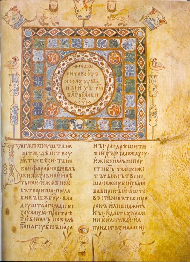
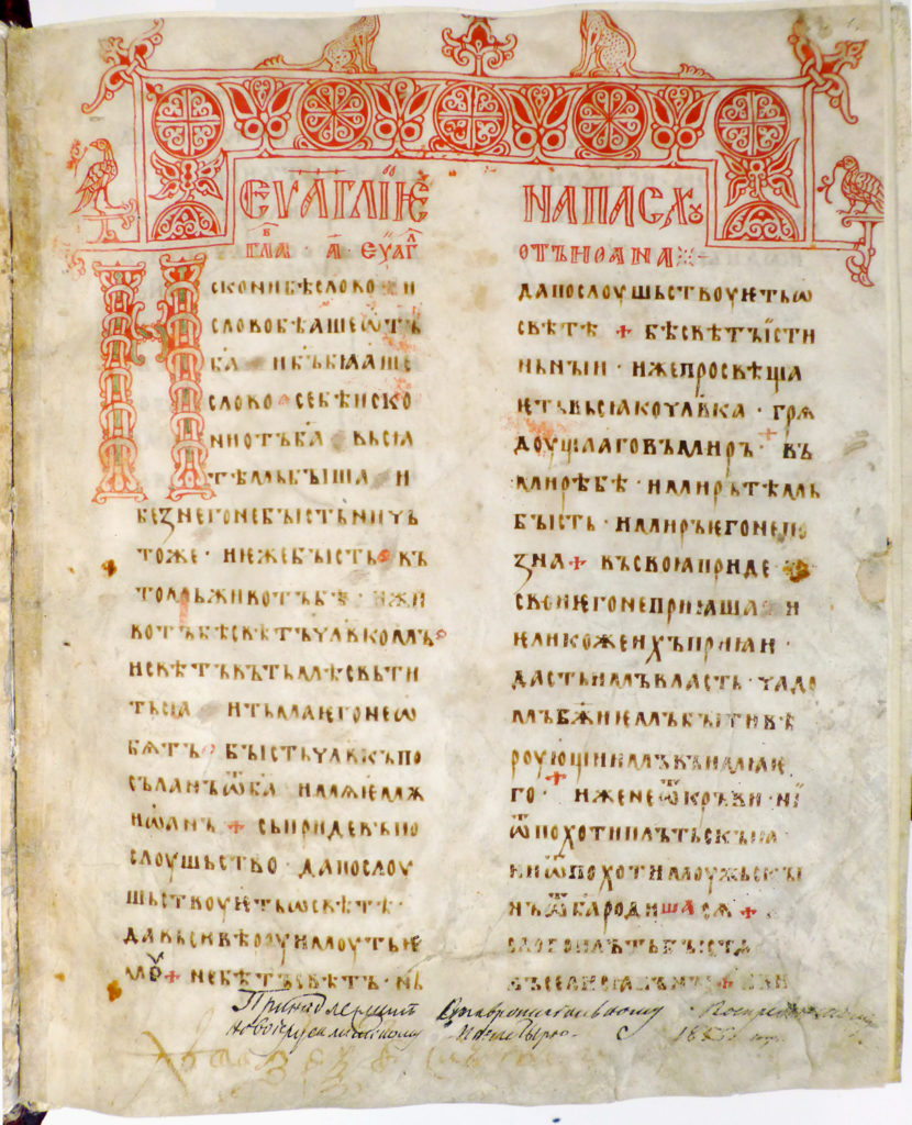
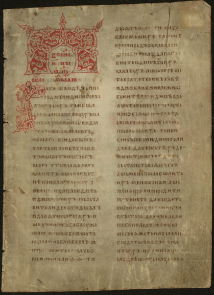
jeb: A page from the Orshanskoe Evangelie, written in ustav hand, second half of the 13th century. Photo in public domain. jeb: Page from the Siyskiy Gospel, 1339, written in ustav hand. Photo in public domain. jeb: A page from the Kiev Psalter, 1397, written in liturgical ustav. Photo in public domain.
In the last quarter of the 14th century, there appeared a very simple hand, which researchers have rightfully classified not as ustav, but as poluustav (see more about poluustav in Chapter 9). This early, pure form of Russian poluustav flowed directly from the Russian ustav of the 14th century. Like ustav, it was a straight hand, that is, it had vertical letters. It also preserved the recent spelling changes from ustav and its later forms, but imported to them an extremely simple and plain appearance, due to the fact that measured artistic lines and curves were replaced by somewhat freer movements of the pen. Out of the new forms which made up this early poluustav, we note the letter ч with a strongly abbreviated or missing stem, and two special types of the letter е used to signify ѥ (je): 1) a narrow, vertical е with a long, raised tongue, and 2) a wide е, almost completely lying upon the line, and as a result, particularly resembling an anchor. As with the ustav semi-recumbent е, both of these forms signified an original iotated ѥ, but toward the end of the century also began to sometimes be used to indicate a simple е. In addition, this early poluustav included a step-wise letter к (k), as well as one with overlapping loops, and instead of the large, beautiful letter з (z), we see one that is small and unattractive, or with a broken pattern (illustration 39, compare the later letters z at the end of row 6 to the earlier ones on row 7). In 14th-century poluustav, the letter ж typically lacked a head, and the letters н, и, ѥ, ю and ꙗ had a raised crossbar, which was only slightly slanted. Only the letter и was written similarly to modern printed Russian; this form of the letter was written without raising the pen. Generally, the signifying line of this poluustav held no worse than in ustav, but its clarity was a bit worse due to the fact that the handwriting was not as good. This early Russian poluustav, as with the mannered liturgical ustav, is also seen in manuscripts into the early 15th century. The latter from this time was even particularly beautiful and large. But, generally speaking, at the turn of the 14th-15th centuries, Russian writing styles and orthography underwent a radical change, resulting from a strong South Slavic influence.[8]We find it to be confusing to refer to two South Slavic influences, one in the 10th century which created Russian culture, and another in the 14th and 15th centuries which altered it. Needless to say, by the word “influence,” we are referring to the latter.
In the late 14th century, the South Slavic states of Serbia and Bulgaria collapsed; the Turkish yoke became established in the Balkans. From this moment, many learned churchmen fled from the Balkans to Russia, bringing with them their hands, their spelling, their Church Slavonic language, and their political ideas. These South Slavs, including prominent political and literary minds (among them, Metropolitan Cyprian, Gregory Tsamblak, and Pachomius the Serb) forcefully sowed their South Slavic influence in Russia in these areas of culture. In Russian paleography, these influences made up a kind of coup. One cannot examine it without first become acquainted, broadly speaking, with the history of South Slavic writing styles up through the late 14th century. We note that, timewise, the South Slavic influence coincided with the division of the Russian lands into two government unions: Lithuanian and Muscovite. These unions experienced and processed the South Slavic influence separately from one another, and as a result, differently. As a result, starting from this time of the South Slavic influence, the writing styles of the West-Russian and East-Russian states began to diverge. The last common link for both forms of writing was 14th-century ustav. Up until the time of poluustav, the hands of Western and South-Western Russia were little different from the hands of Novgorod, Moscow, and the other Great Russians, although toward the end they began to differ slightly in their manner and outer form, seen in very small differences in the ornamental character of writing for individual letters. Aside from this, Western and South-Western ustav of the 13th and 14th centuries was less cut off from Balkan influences than the Great Russians, which explains why, for example, sometimes in the West by the 13th and 14th centuries they sometimes used the lopsided ч and the letter ѡ with a tall center.
Footnotes
| ↟1 | jeb: These were listed in Chapter 9: the Ostomir Gospel of 1056-1057, the Svyatoslav Izborniks of 1073 and 1076, the Arkhangelsk Gospel of 1092, and three Novgorodian Menaia from the 1090s. |
|---|---|
| ↟2 | Mainly for practical purposes in this work, we will not provide lists of undated manuscripts, even from these earliest time periods. |
| ↟3 | There are 8 Russian works dated to the 12th century: 1. The (luxurious) Mstislav Gospel, written around 1115; 2. the Yuriev Gospel, written around 1120; 3. the Galician Gospel, written in 1144; 4. a holiday sticherarion written in 1157 (the above four are stored in the Patriarchal Library in Moscow); 5. a holiday sticherarion written around 1160 (Petrograd Theological Academy), 6. the Dobrilovo Gospel from 1164 (the Moscow Rumjaitskaja Academy); 7. the letter from Princes Mstislav and Vsevolod to Novgorod’s Yuriev Monastery, written around 1130; 8. a grant letter (Rus. вкладная грамота, vkladnaja gramota, “contribution certificate”) from the Reverend Varlaam to the Khutyn Monastery near Novgorod, written around 1192. There are significantly more undated works from the 12th century. |
| ↟4 | The omega with a tall center and the cross-shaped psi are in essence Greek uncial forms from the 10th century; omega with a shortened center like and lily-shaped psi are Greek uncial types from the 11th century. This is evidence that Byzantine writing styles were reflected in Russia following a delay of about 100 years. |
| ↟5 | jeb: by the Tatar Invasion. |
| ↟6 | The semi-recumbent anchor-like е is a modification of the Greek wide ε (epsilon) standing upright. This Greek ε had only a decorative meaning and was seen in the earliest Cyrillic. In the Ryazan’ Kormchaja (Rus. кормчая книга, kormchaja kniga, lit. “pilot book”) from 1284 and in a Psalter from 1296, this decorative е for the first time was somewhat similar in design to the anchor-like е, but still stood upright, although its tongue was already raised (illustration 39, row 4). |
| ↟7 | In the second half of the 13th century, one still encounters manuscripts in which the use of the letters ꙗ/ѧ, ѥ/е was already normalized, but the letter ѹ was still used everywhere. Other manuscripts from the same time period were still inconsistent with regards to all three cases. We remember that in Old Church Slavonic spelling, there was no mixing of any of these letters: ѧ always represented ę (nasalized e), ꙗ always represented ja, ѥ always represented je, е was always e, ѹ always stood for u, and у always represented the Greek υ (upsilon). In order to shorten the bulky letter ѹ, the letter ꙋ was used in early Cyrillic, and it is only in the Russian 13th century that we start to see the letter у used in this sense. |
| ↟8 | We find it to be confusing to refer to two South Slavic influences, one in the 10th century which created Russian culture, and another in the 14th and 15th centuries which altered it. Needless to say, by the word “influence,” we are referring to the latter. |